
Friendly Faces
Visual Identity
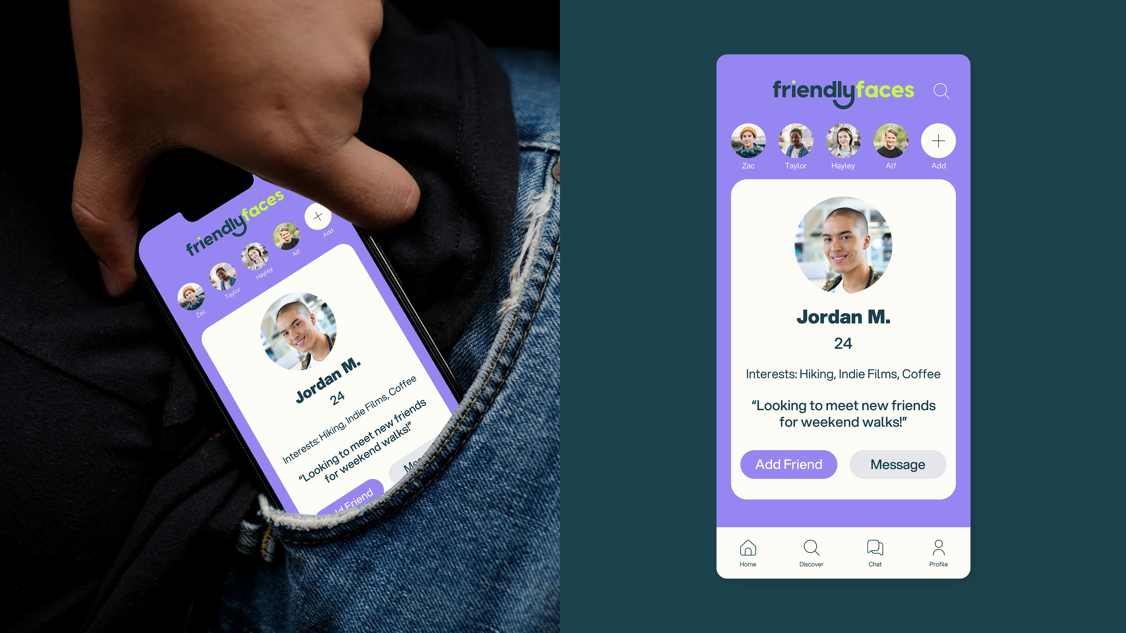
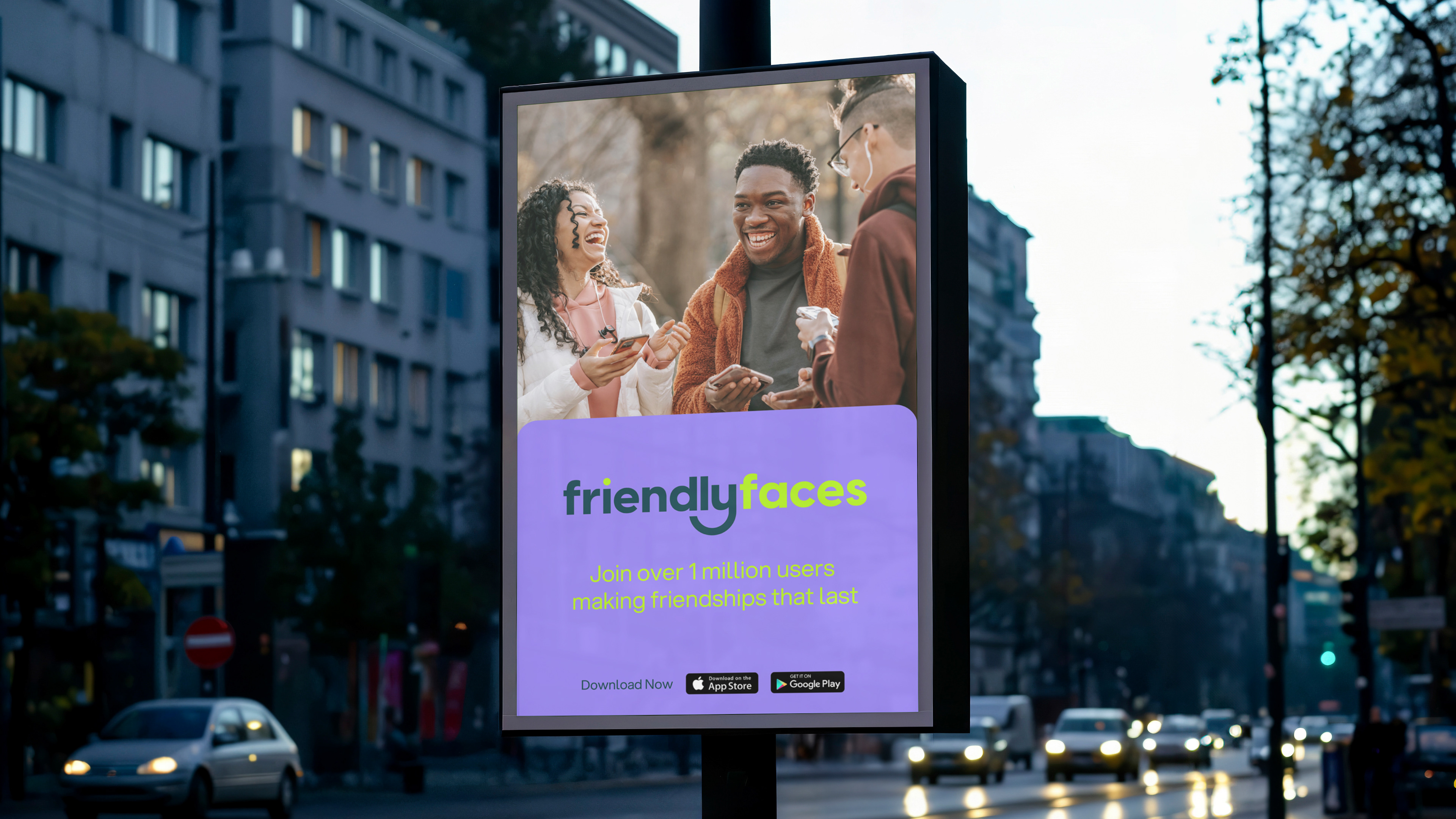
Friendly Faces is a social networking app designed to help young people meet new friends in their area. It connects people through shared interests and hobbies, making it easy to chat, hang out and build genuine connections.
Friendly Faces is a social networking app designed to help young people meet new friends in their area. It connects people through shared interests and hobbies, making it easy to chat, hang out and build genuine connections.
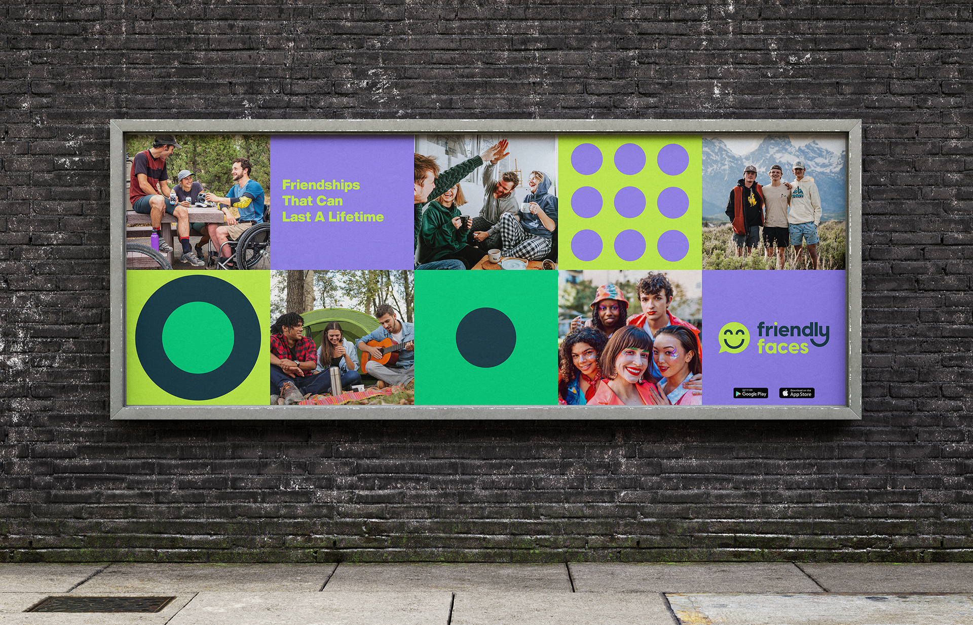
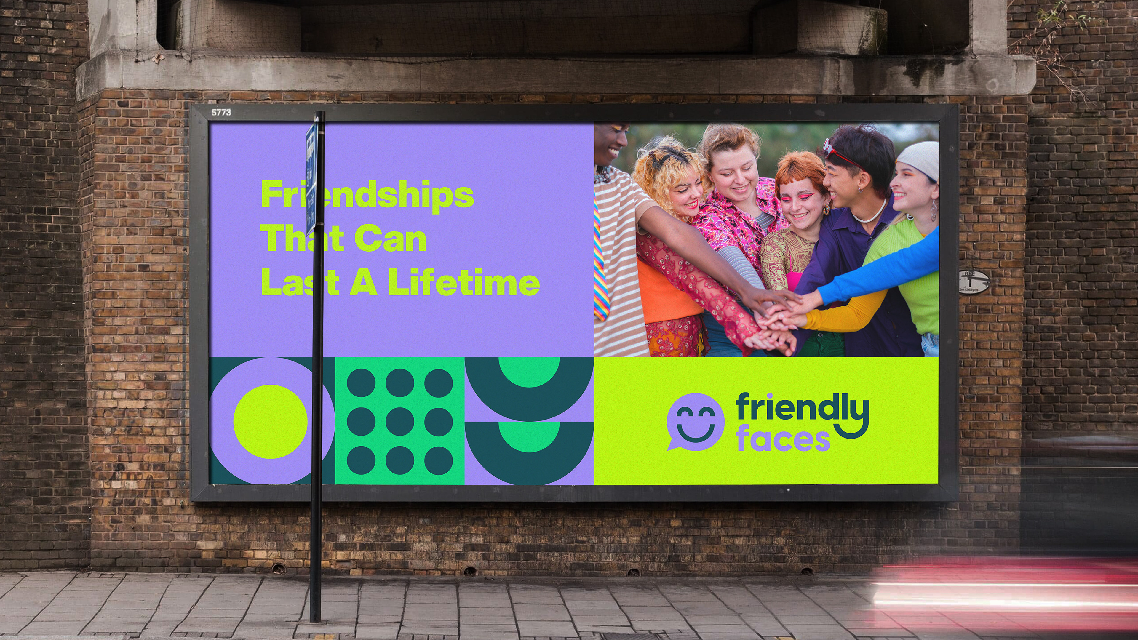
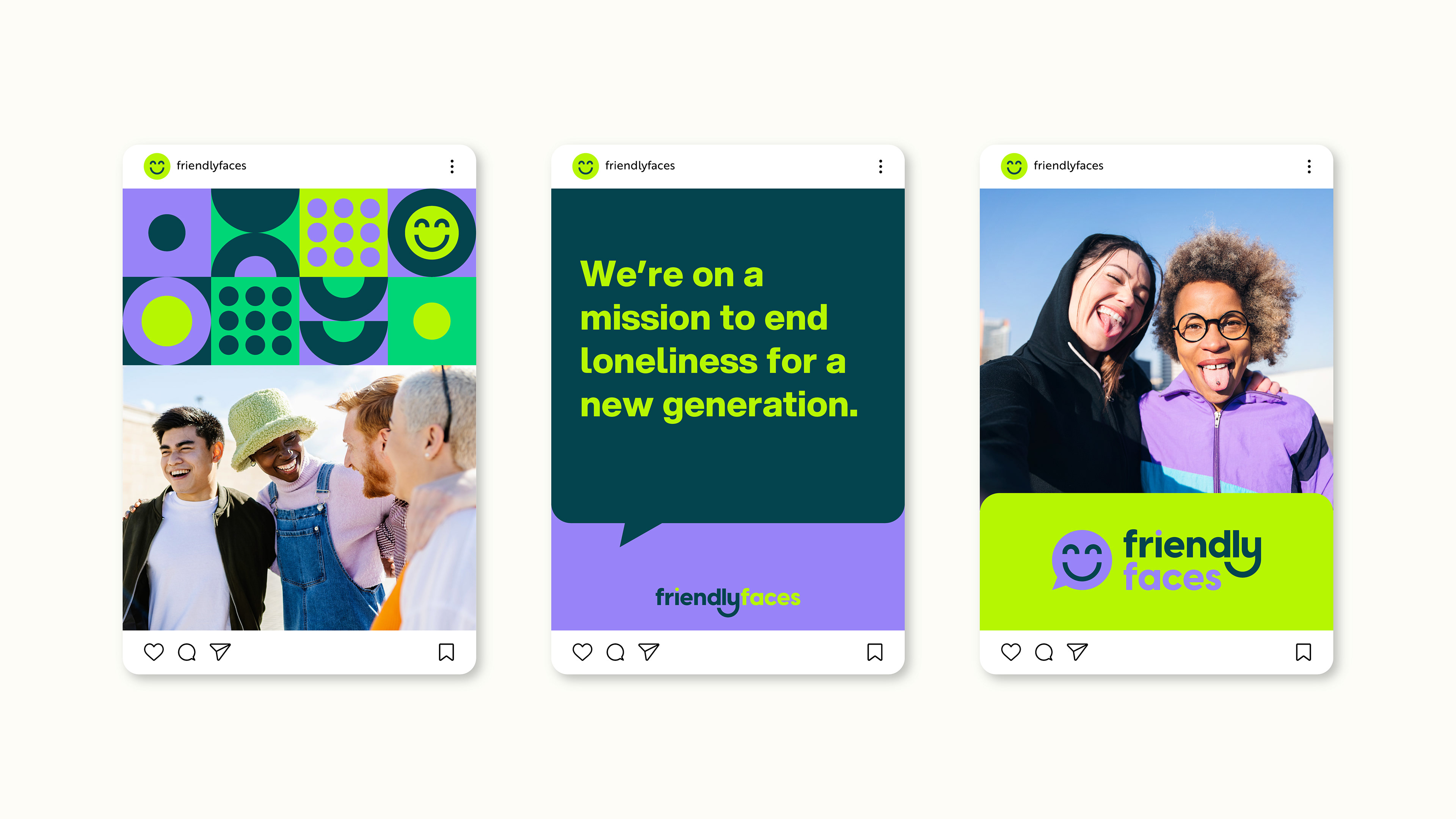
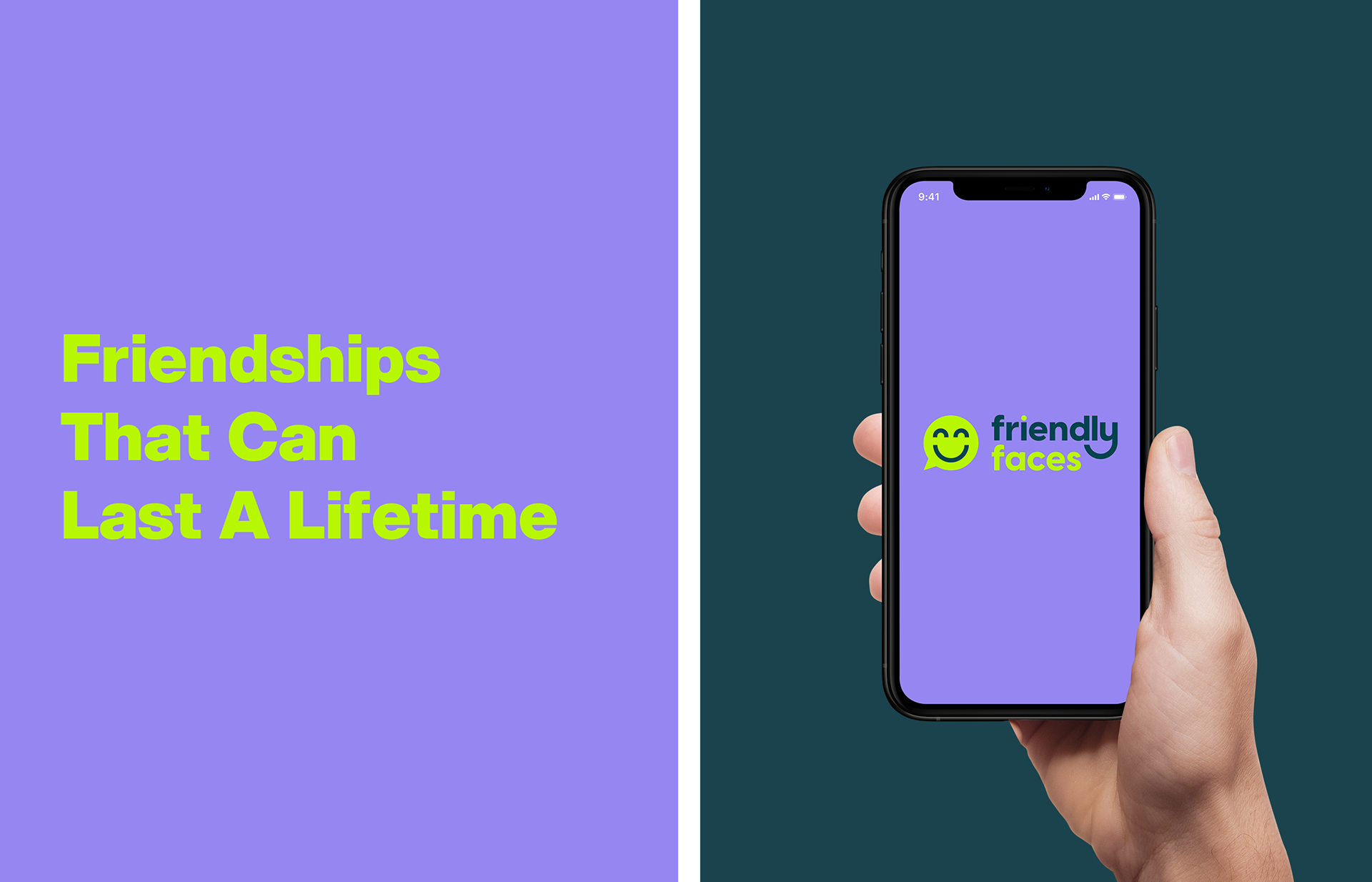
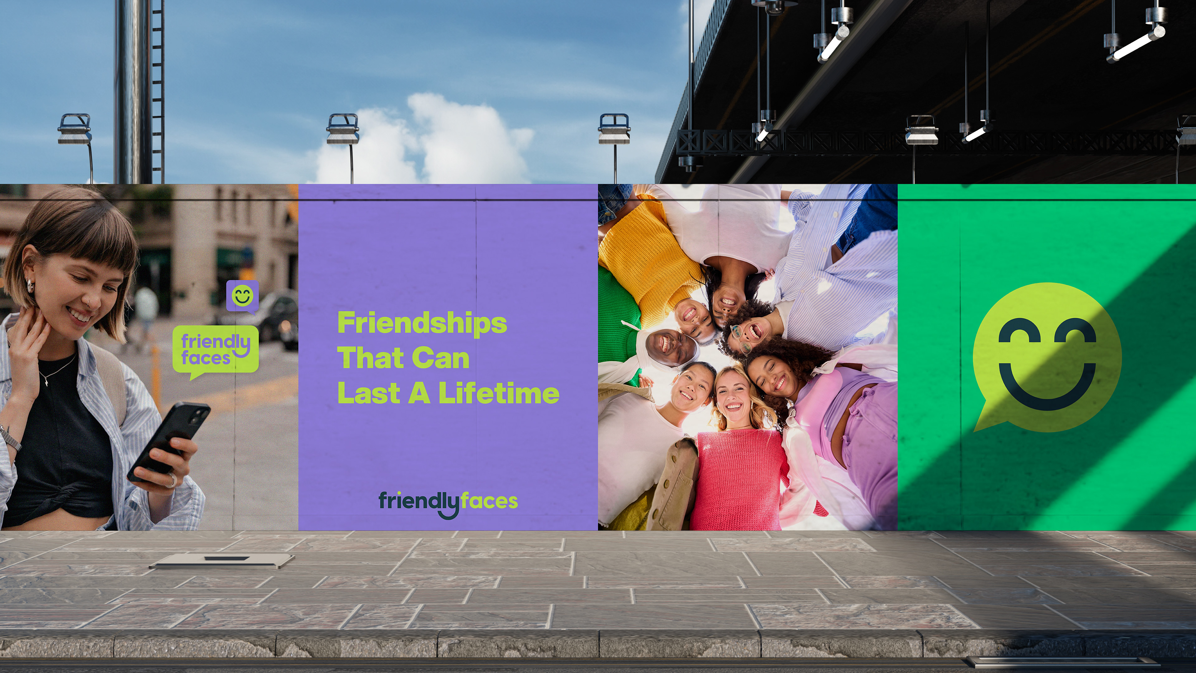
For this project, the goal was to create a vibrant and welcoming visual identity that reflects the app’s mission: helping people form meaningful, long-lasting friendships.
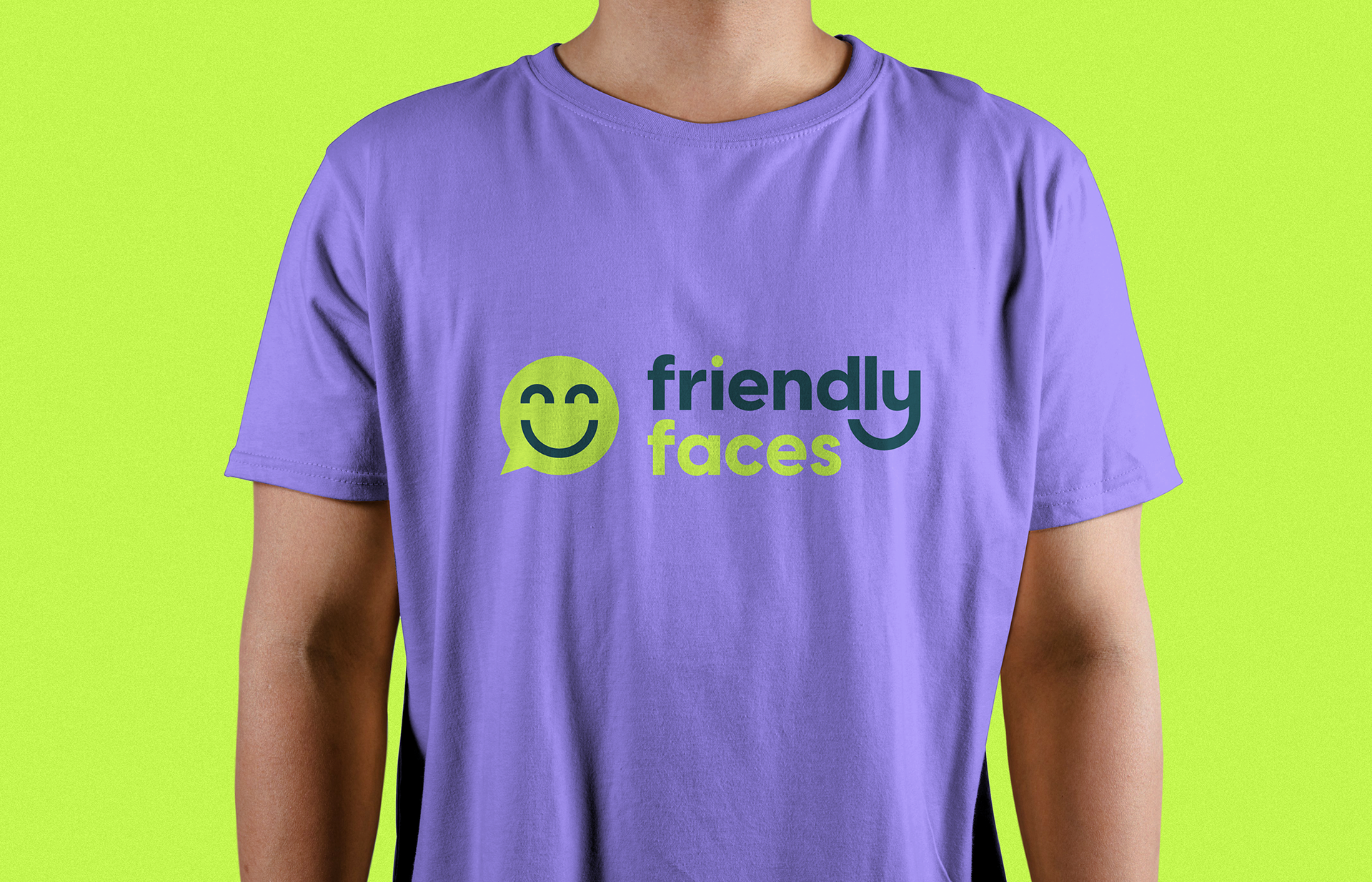
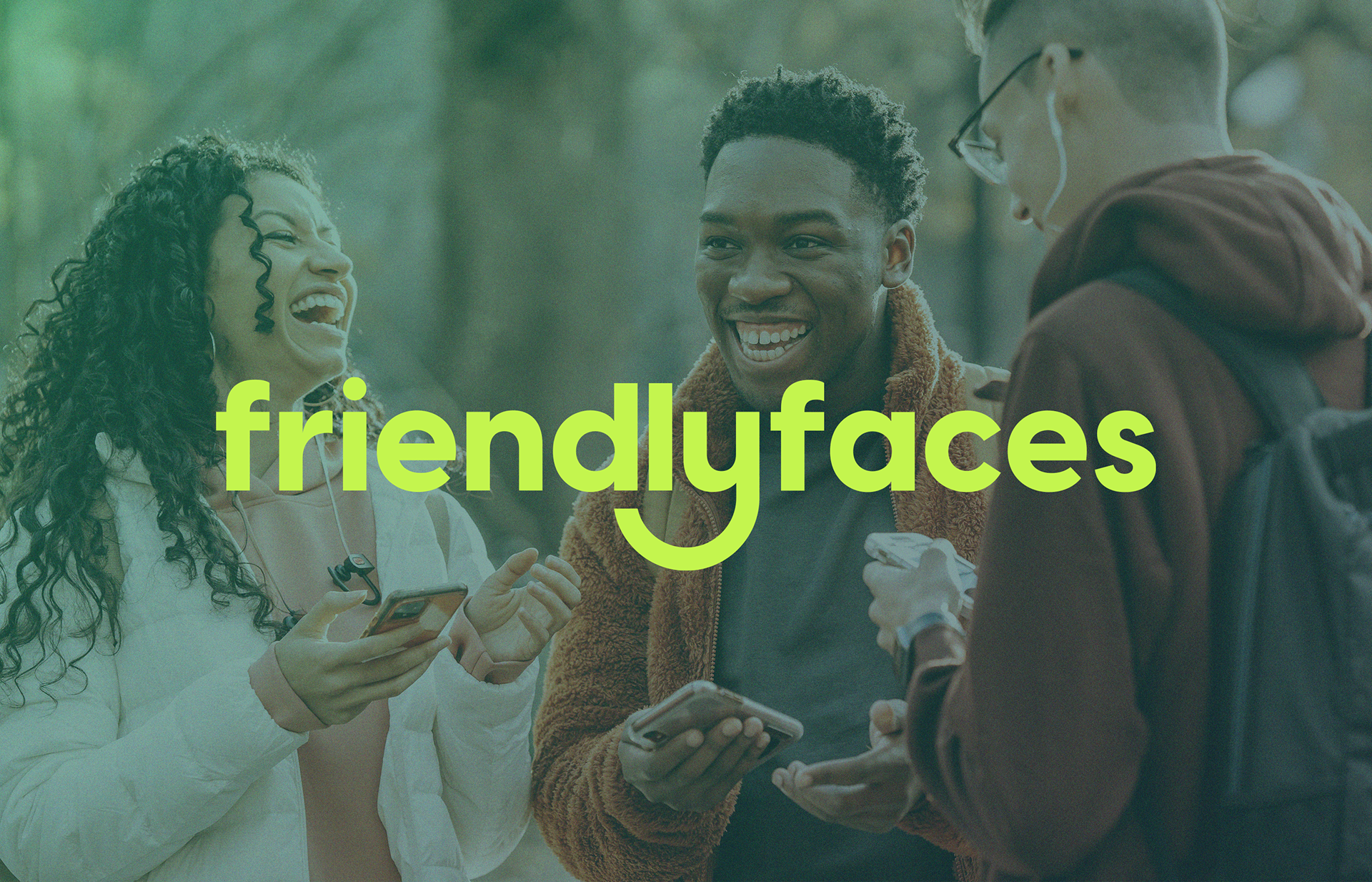
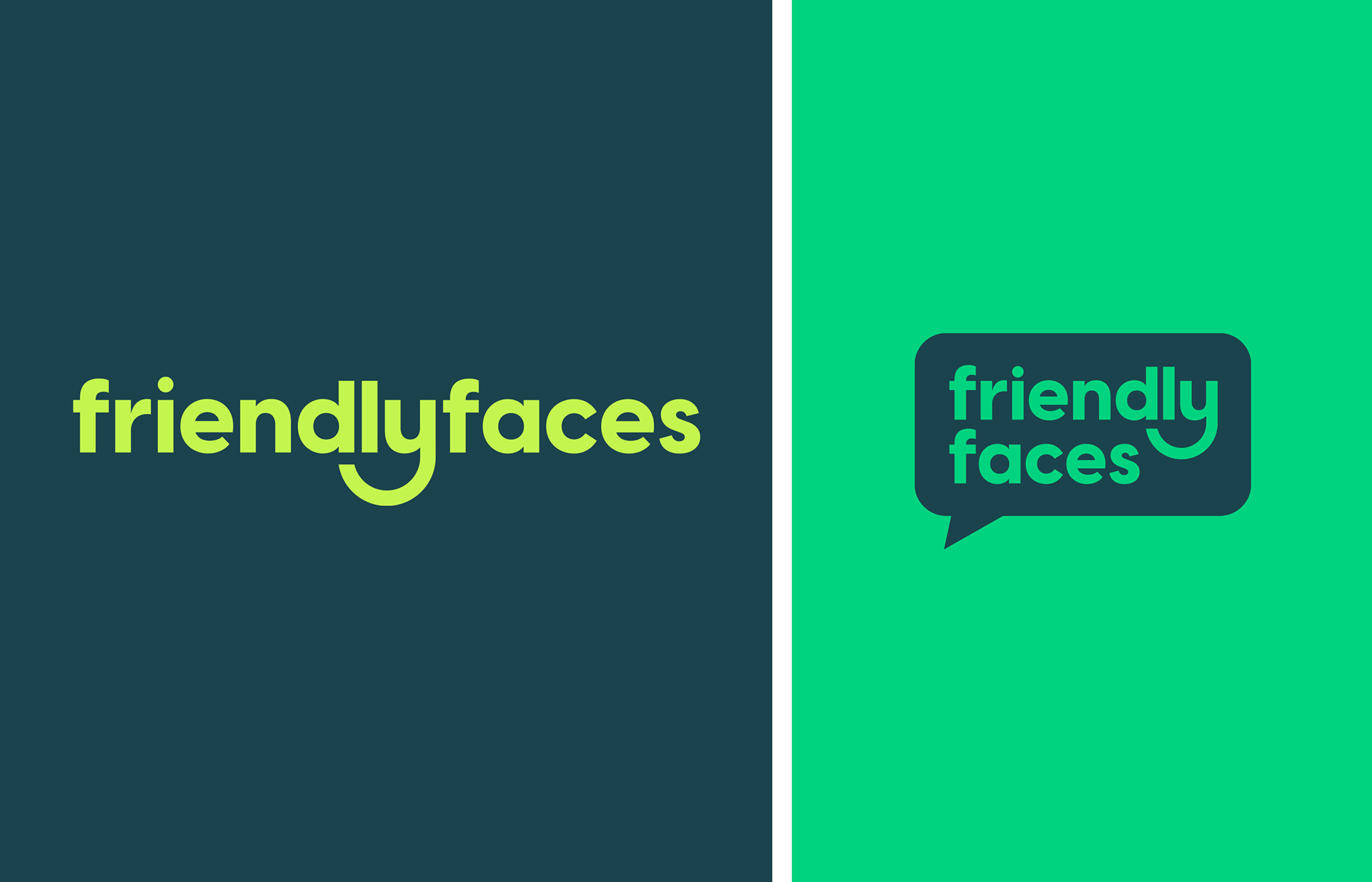
We designed a logotype that is clean and minimal to create a modern, professional feel while being approachable enough to convey warmth and friendliness. The result is a brand that feels both contemporary and genuinely human.
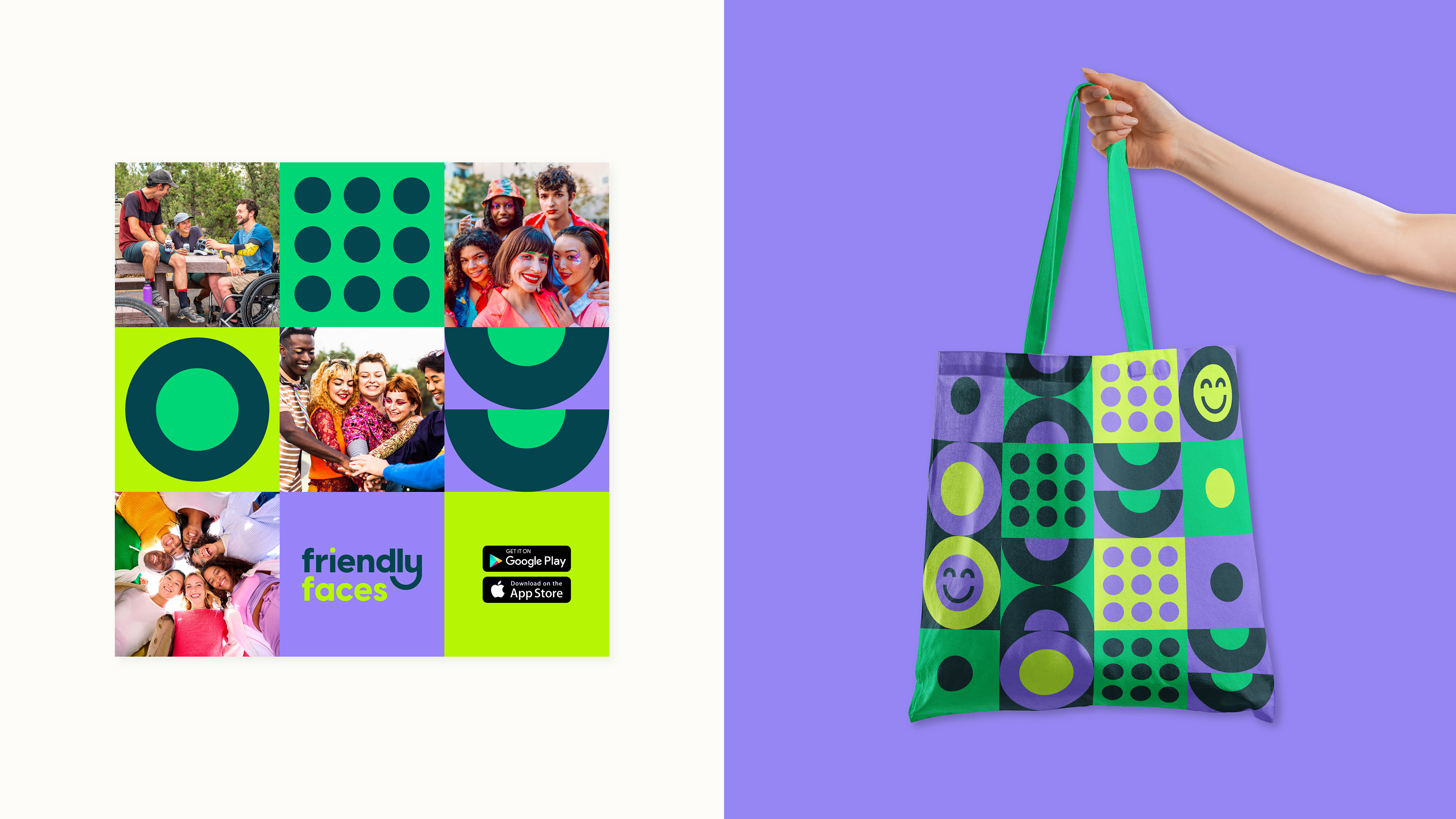
Inclusivity was at the heart of the design process. Everyone deserves to find their tribe, so we represented a diverse mix of cultures and backgrounds throughout the brand’s imagery.
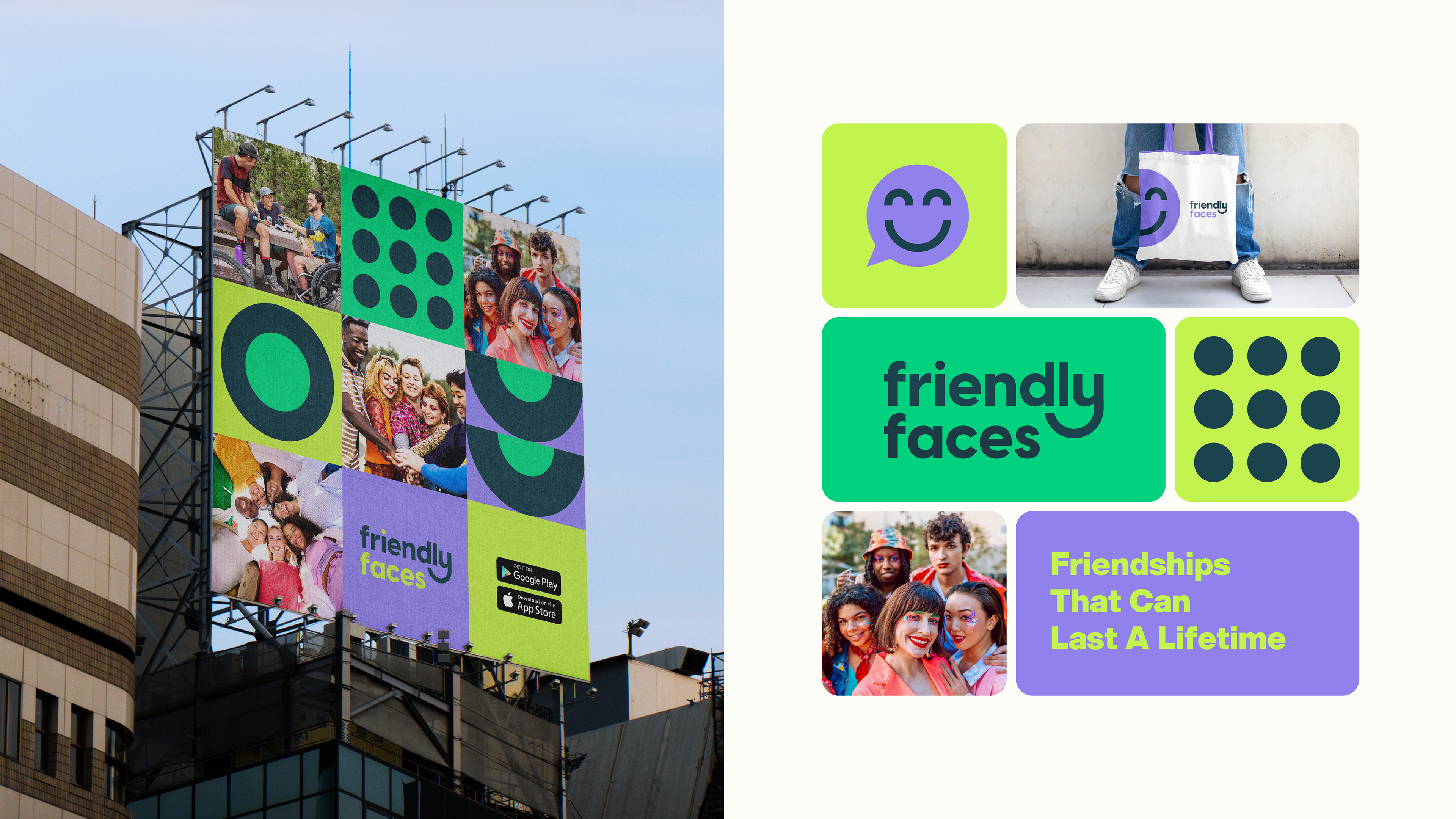
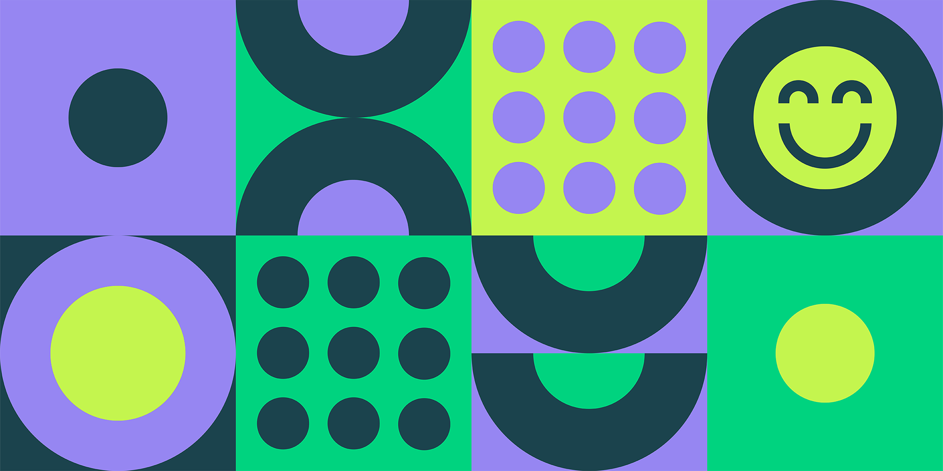
The visual language centres around circles, symbolising unity, connection, and the natural flow of friendship. The colour palette combines bold, contrasting tones to create a lively and memorable aesthetic that stands out in the digital space.