
NOCAFF | VISUAL IDENTITY
NOCAFF is a decaf canned coffee brand made for drinking coffee without the caffeine. It keeps the taste and ritual of coffee while removing the rush that usually comes with it.
The challenge was to create an identity that felt calm without feeling sleepy, and bold without feeling energetic. We wanted to avoid the visual language of both bedtime tea brands and high-energy coffee drinks, finding a space somewhere in between.
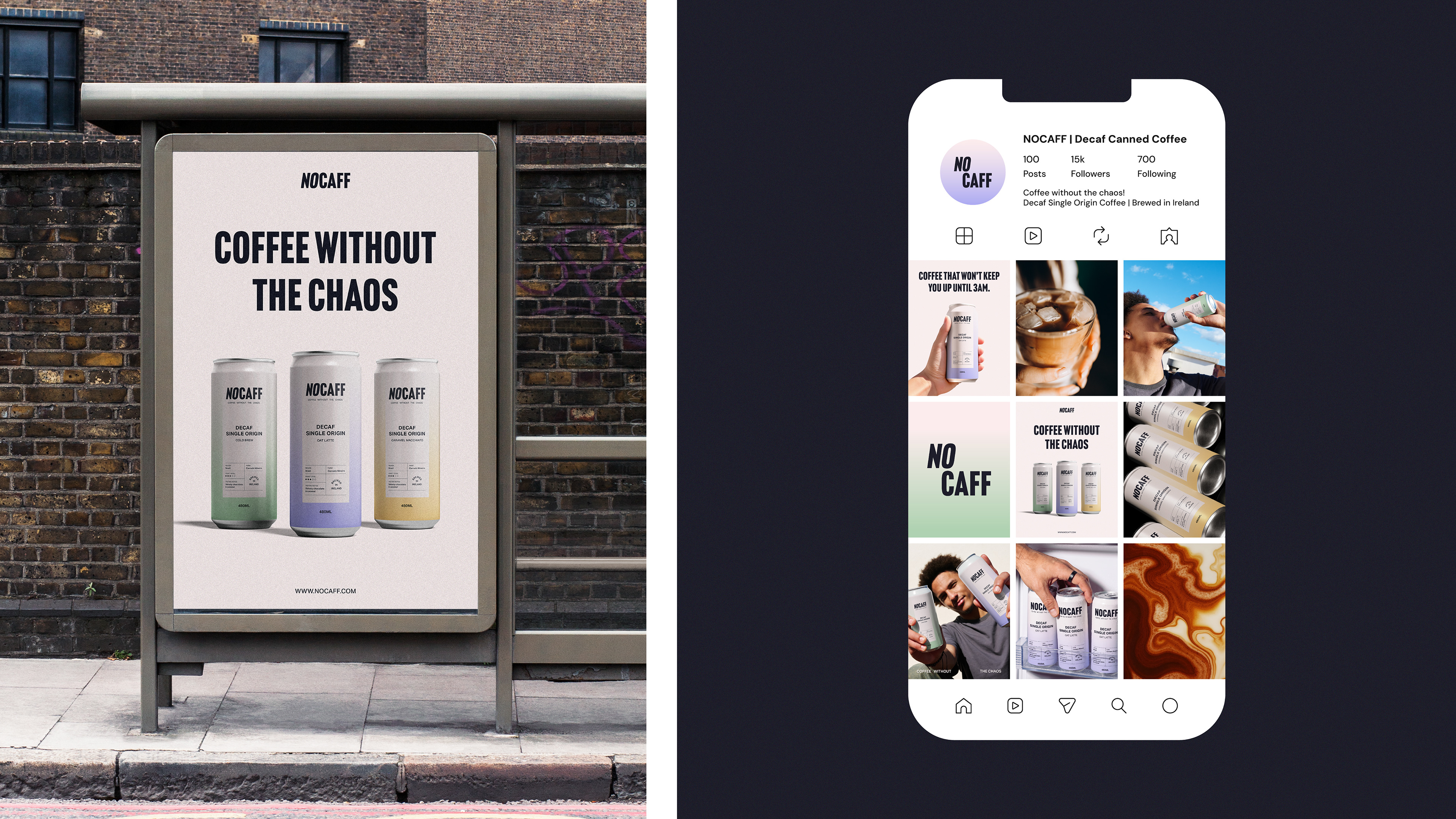
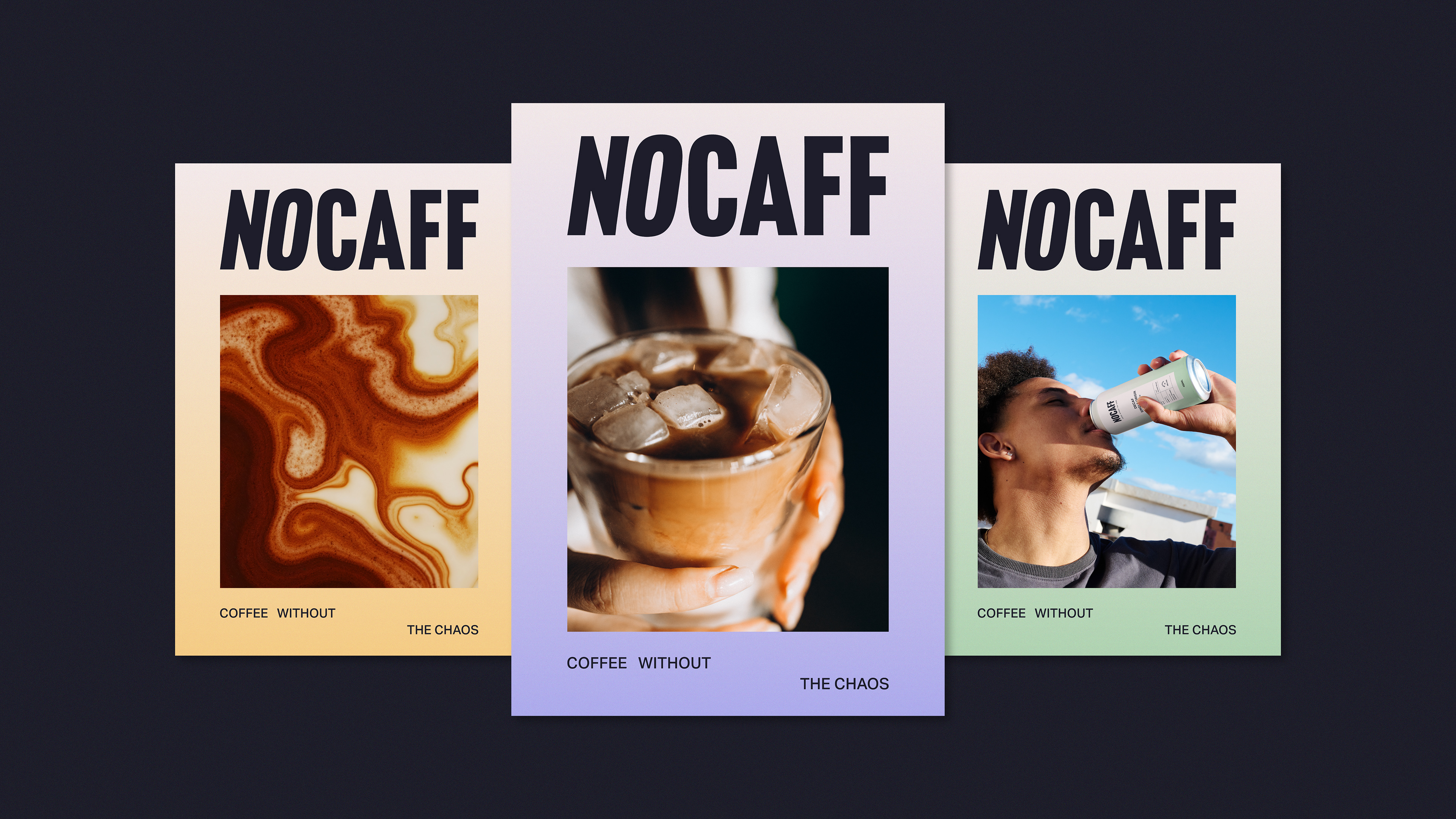
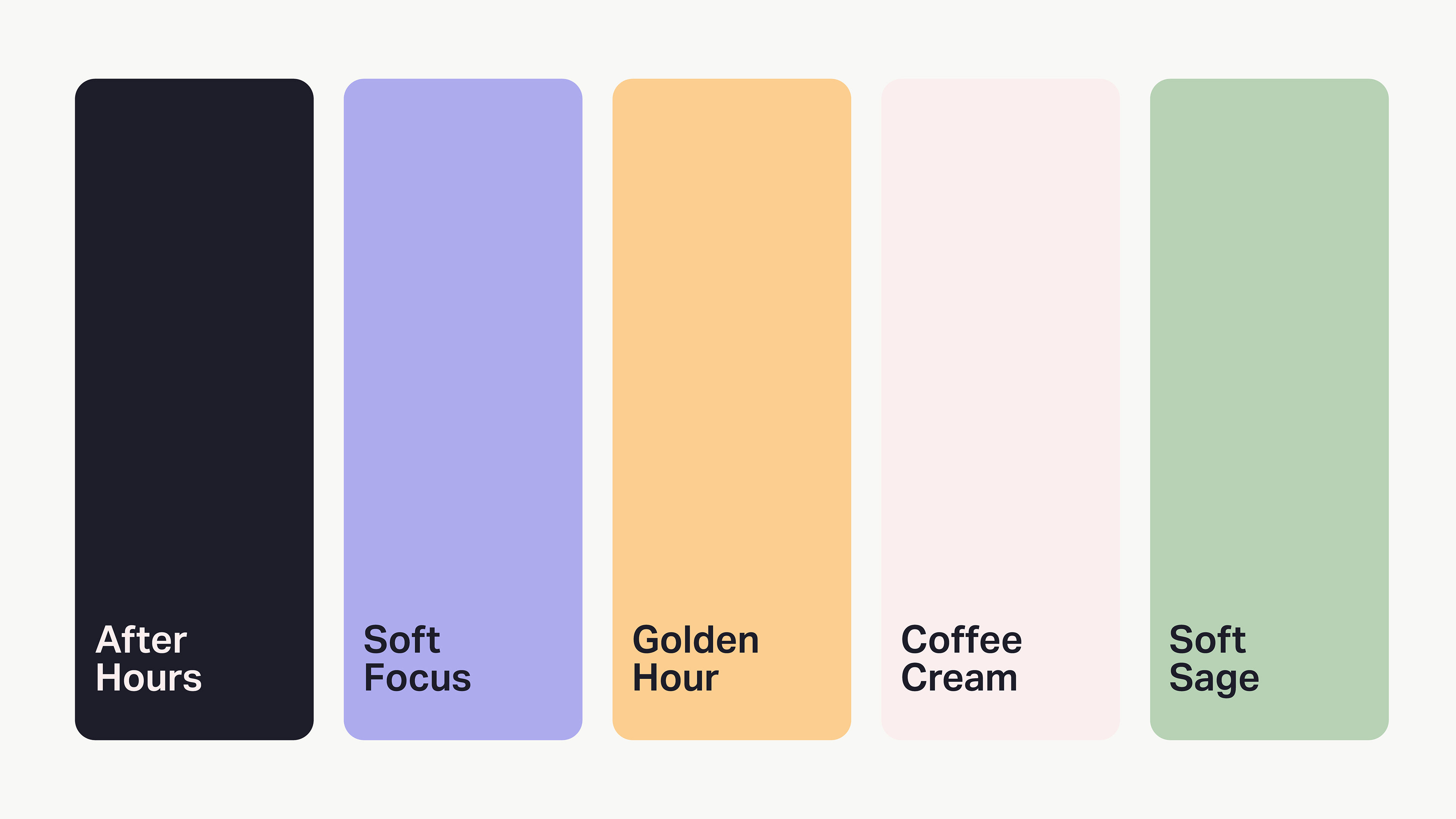
The visual identity reflects this balance. A muted colour palette with soft gradients create a sense of calm and control, while bold, condensed typography and structured layouts bring clarity and confidence. Every element is considered and purposeful, without feeling overstimulating.
The entire identity was built around one simple idea: coffee without the chaos. A more relaxed approach to coffee that keeps the ritual, taste and presence, without the caffeine rush.



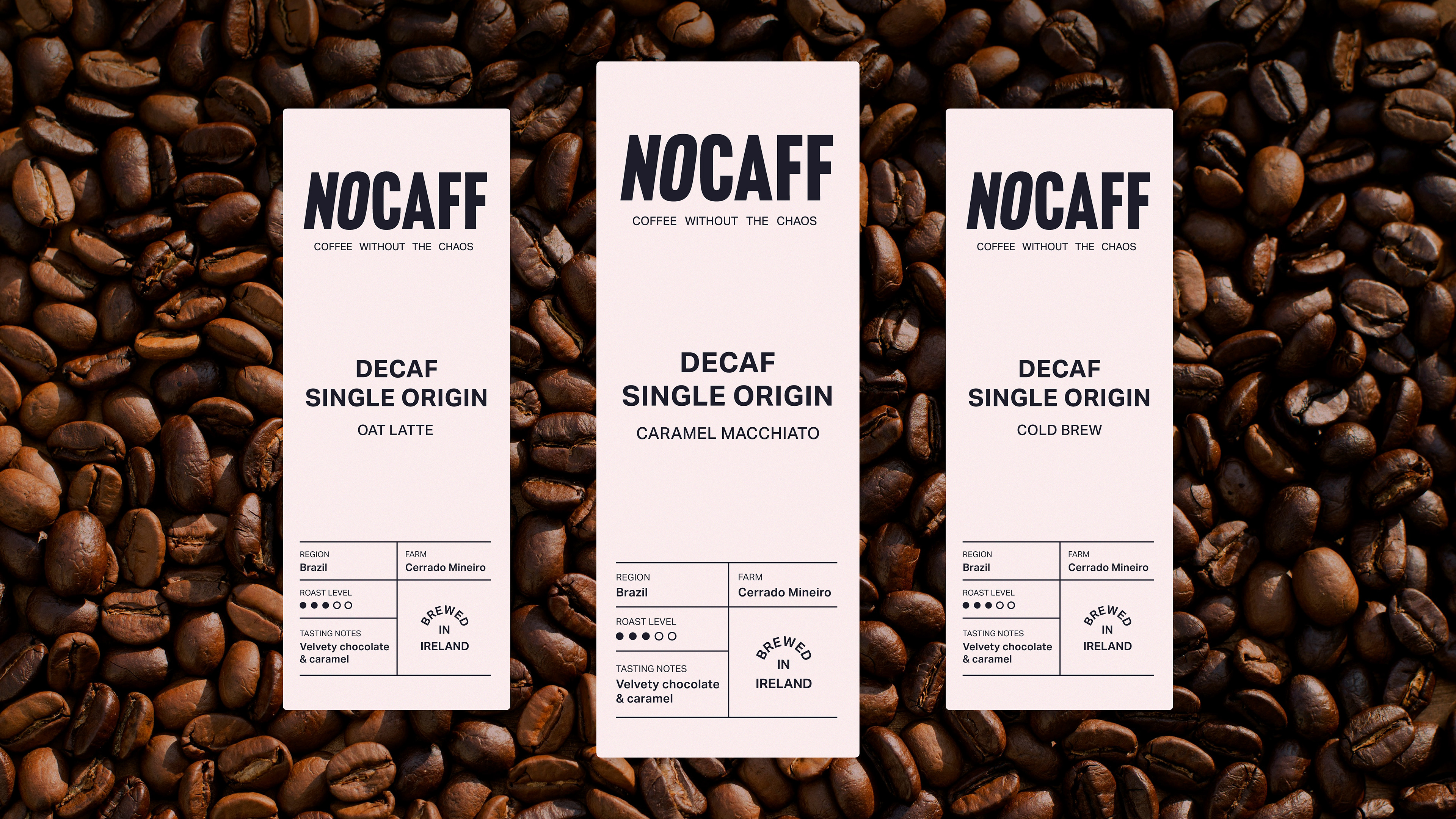
For the packaging, we took inspiration from traditional coffee bags. This helped bring NOCAFF back to its coffee roots, moving it away from the visual language of both bedtime tea and high-energy coffee drinks.
We wanted the cans to feel like real coffee, just without the caffeine. Taking cues from coffee packaging gave us a familiar starting point, while the muted colour palette, soft gradients and bold typography helped create something that felt distinctly NOCAFF.
The labels were kept simple and information led, with details such as the coffee region, farm, tasting notes and roast level becoming part of the design. This gave each coffee its own identity while keeping the overall system consistent.