Foodflow
Visual Identity
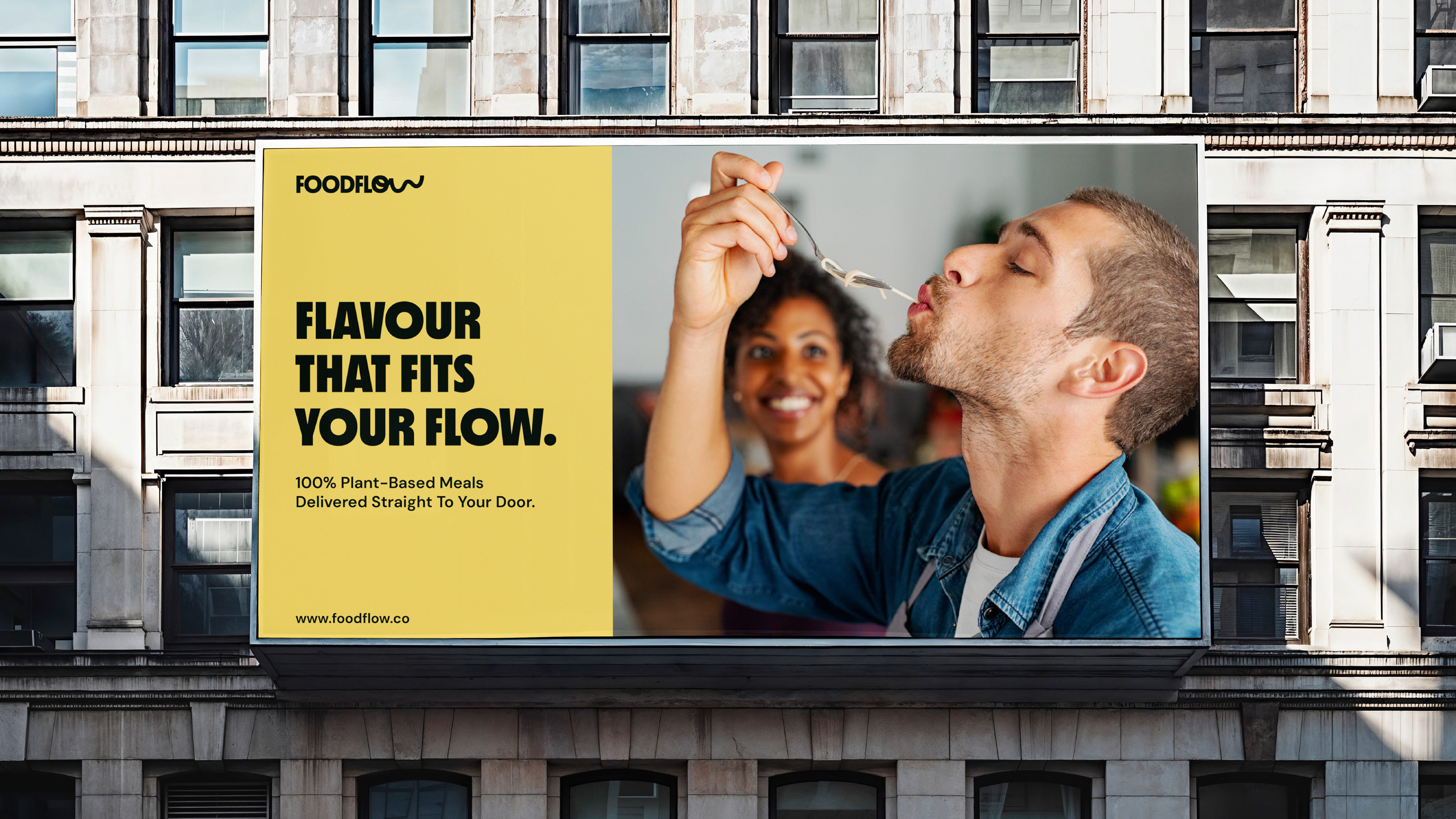
Foodflow entered a crowded plant-based food market, where many competitors relied on predictable “healthy” branding that limited their broader appeal. The opportunity was to position the service as a modern, convenient lifestyle choice rather than a niche vegan product.
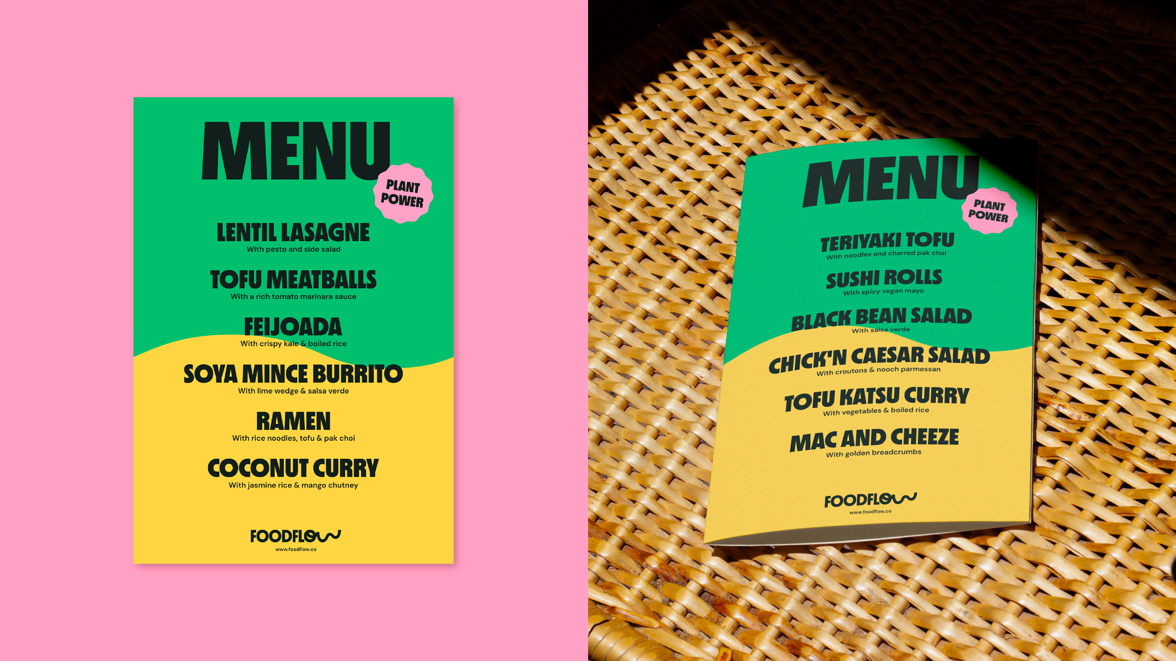
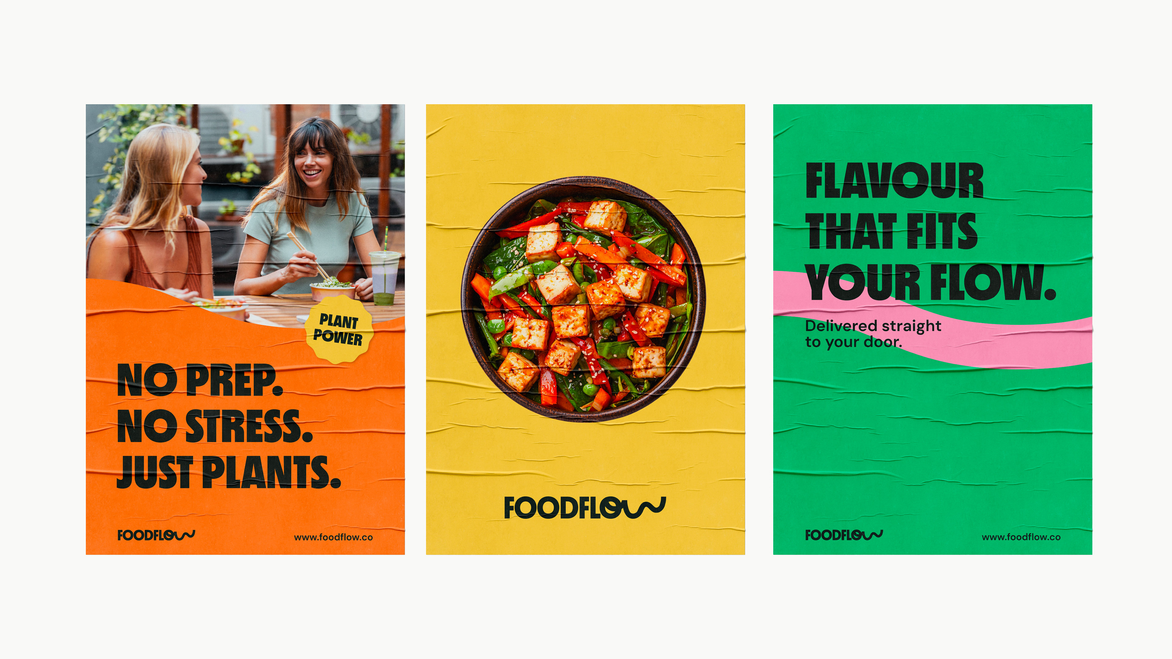
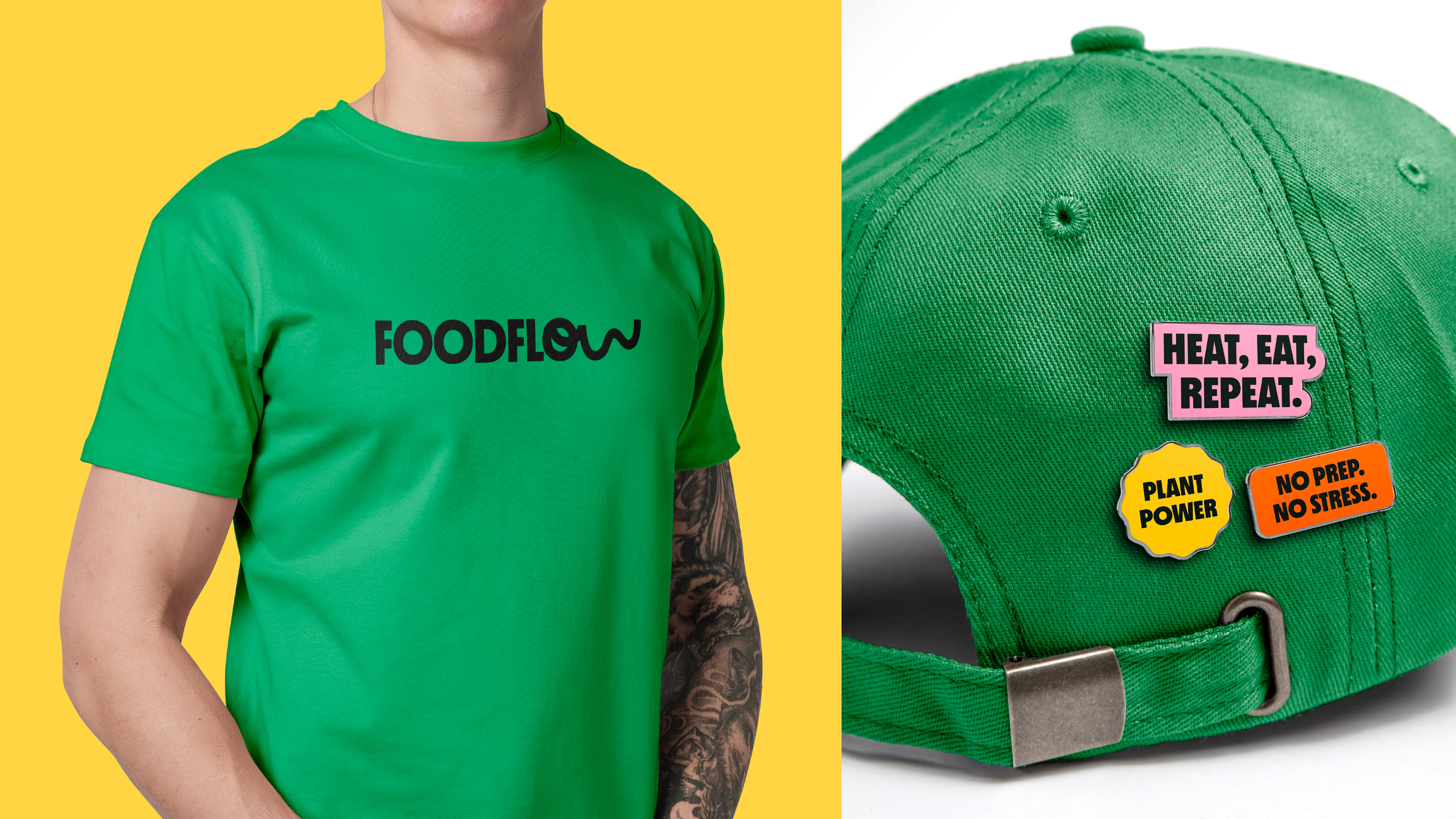
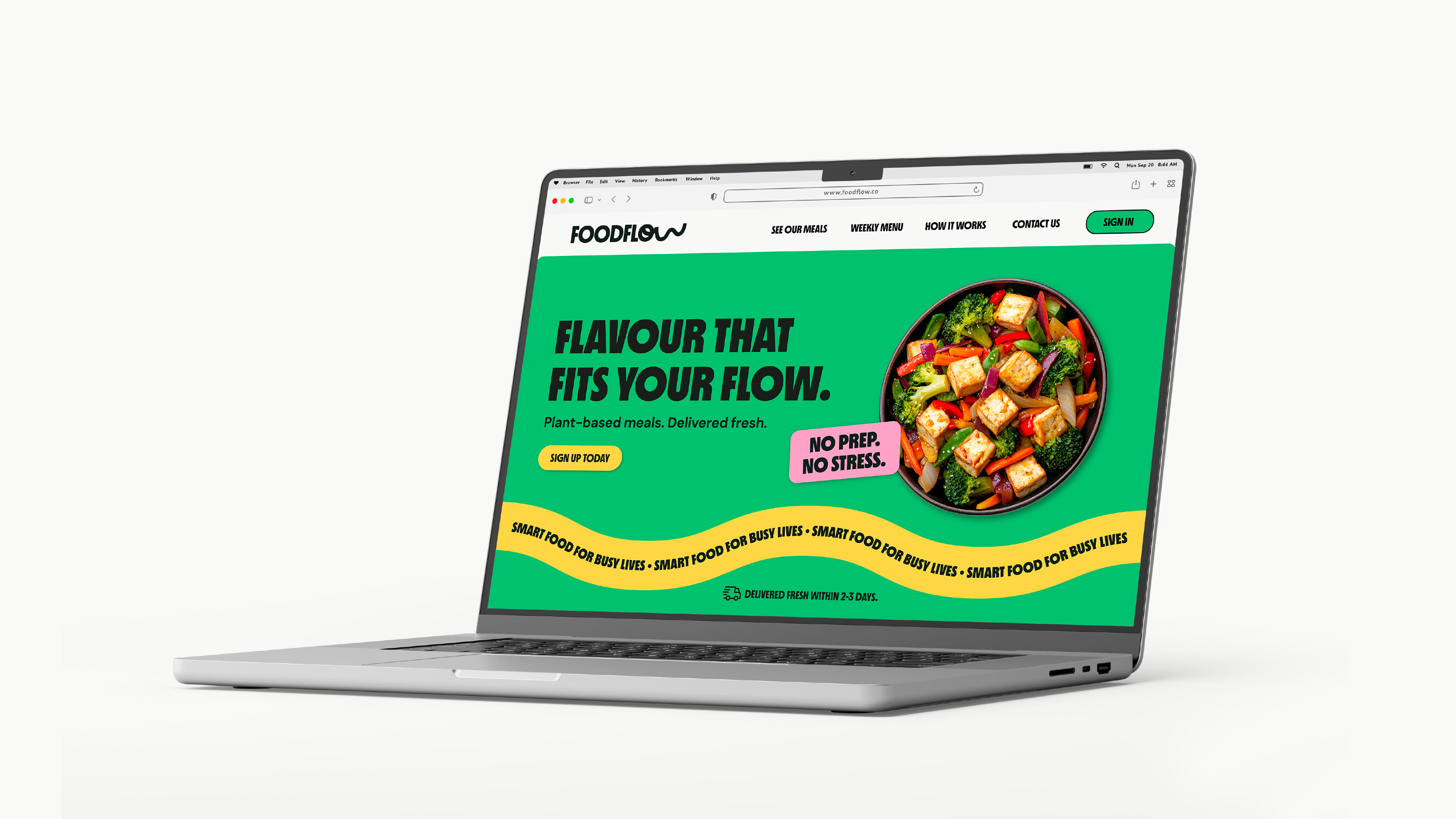
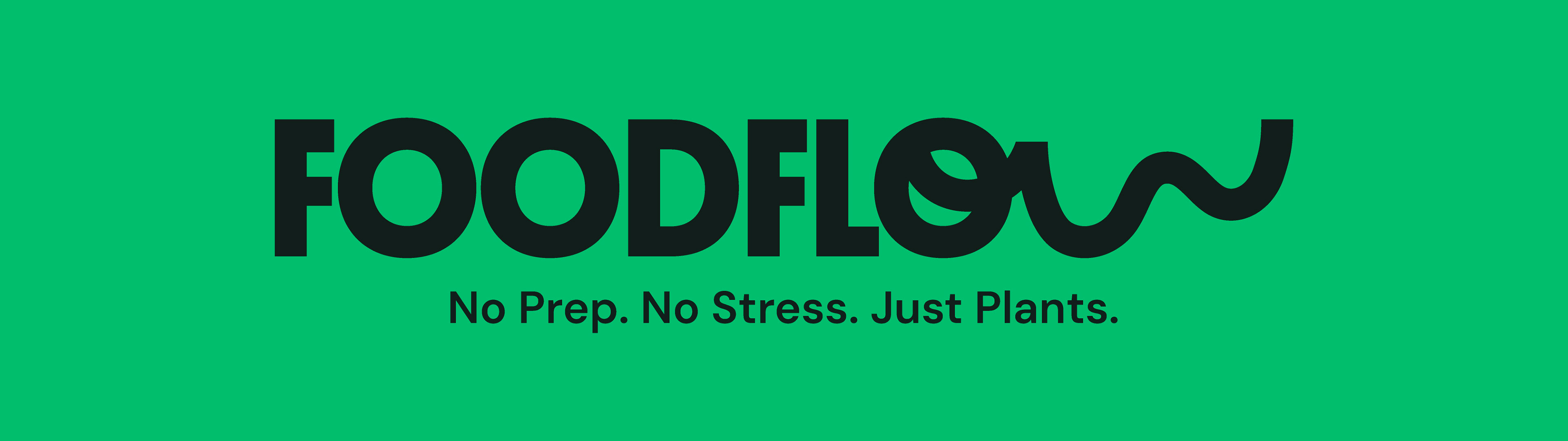
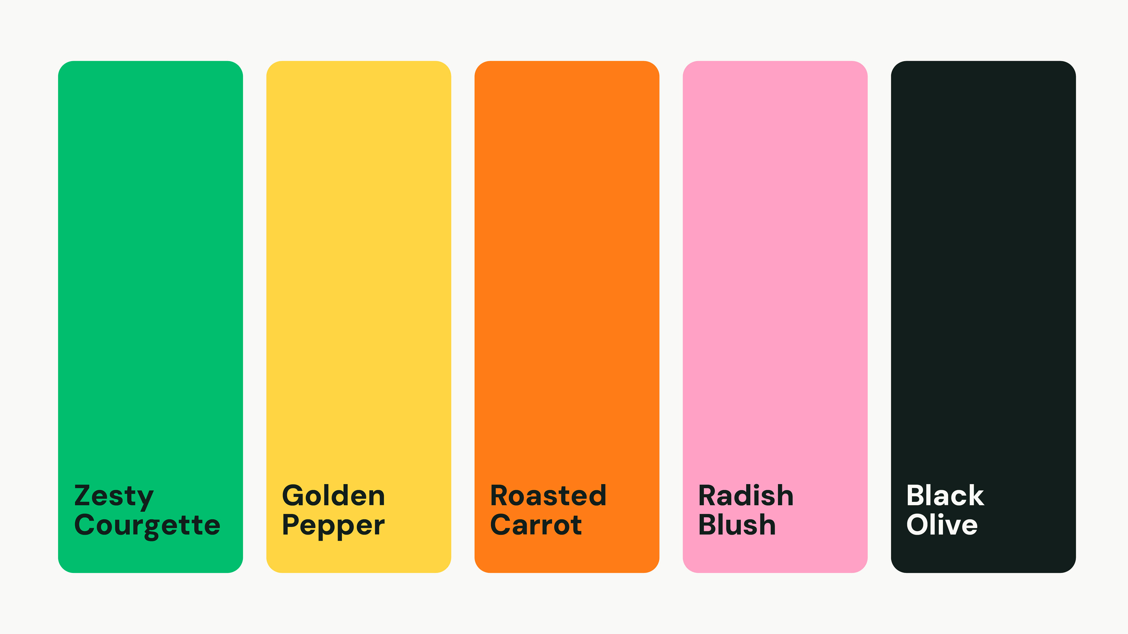
We developed a visual identity built around the idea of effortlessness, reflecting the core value: removing friction from healthy eating. The system was designed to feel vibrant and contemporary while maintaining the clarity and trust required for a subscription-based product.
The result is a flexible brand system that positions Foodflow as a credible, scalable brand in the modern food delivery space.
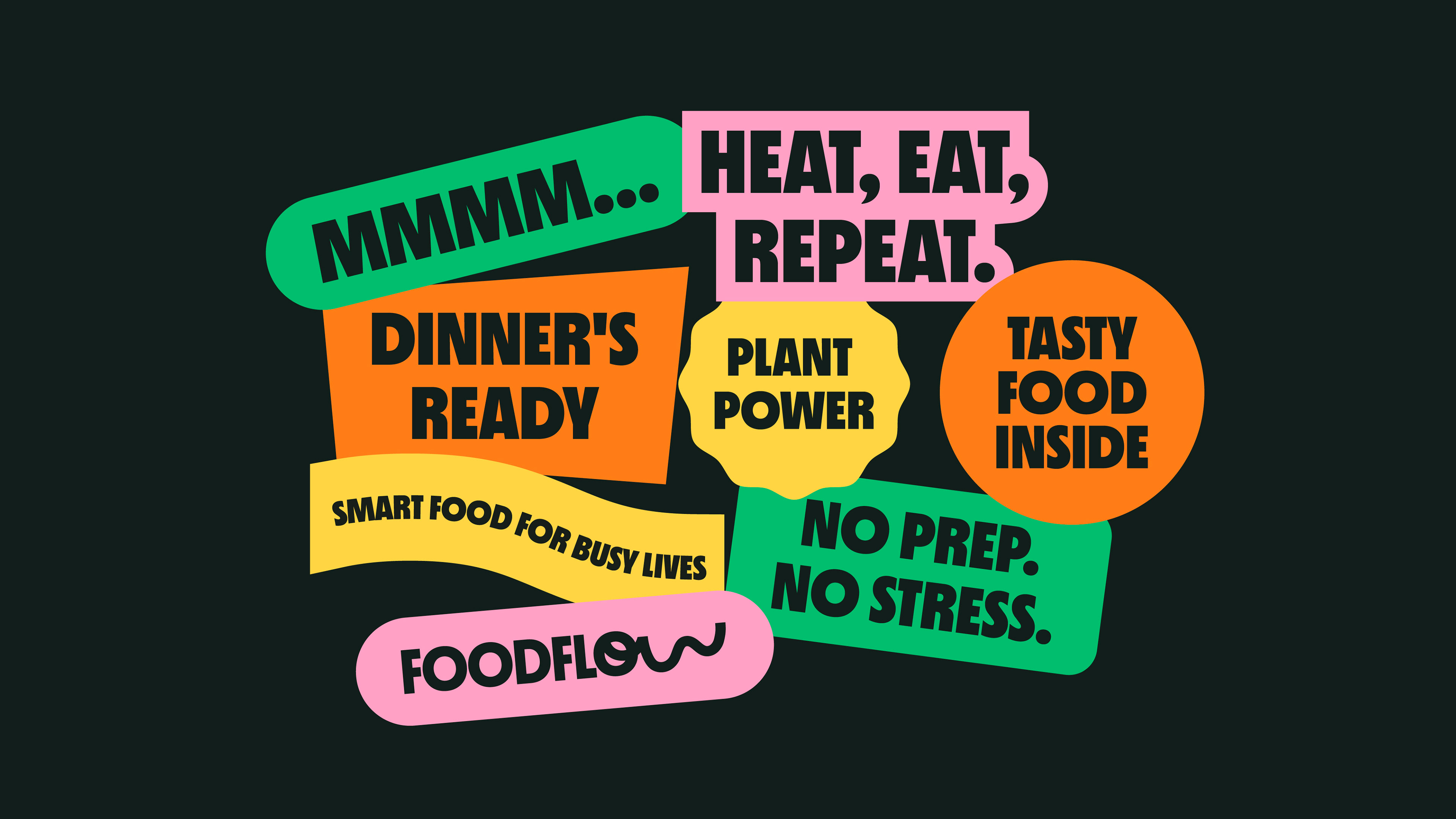
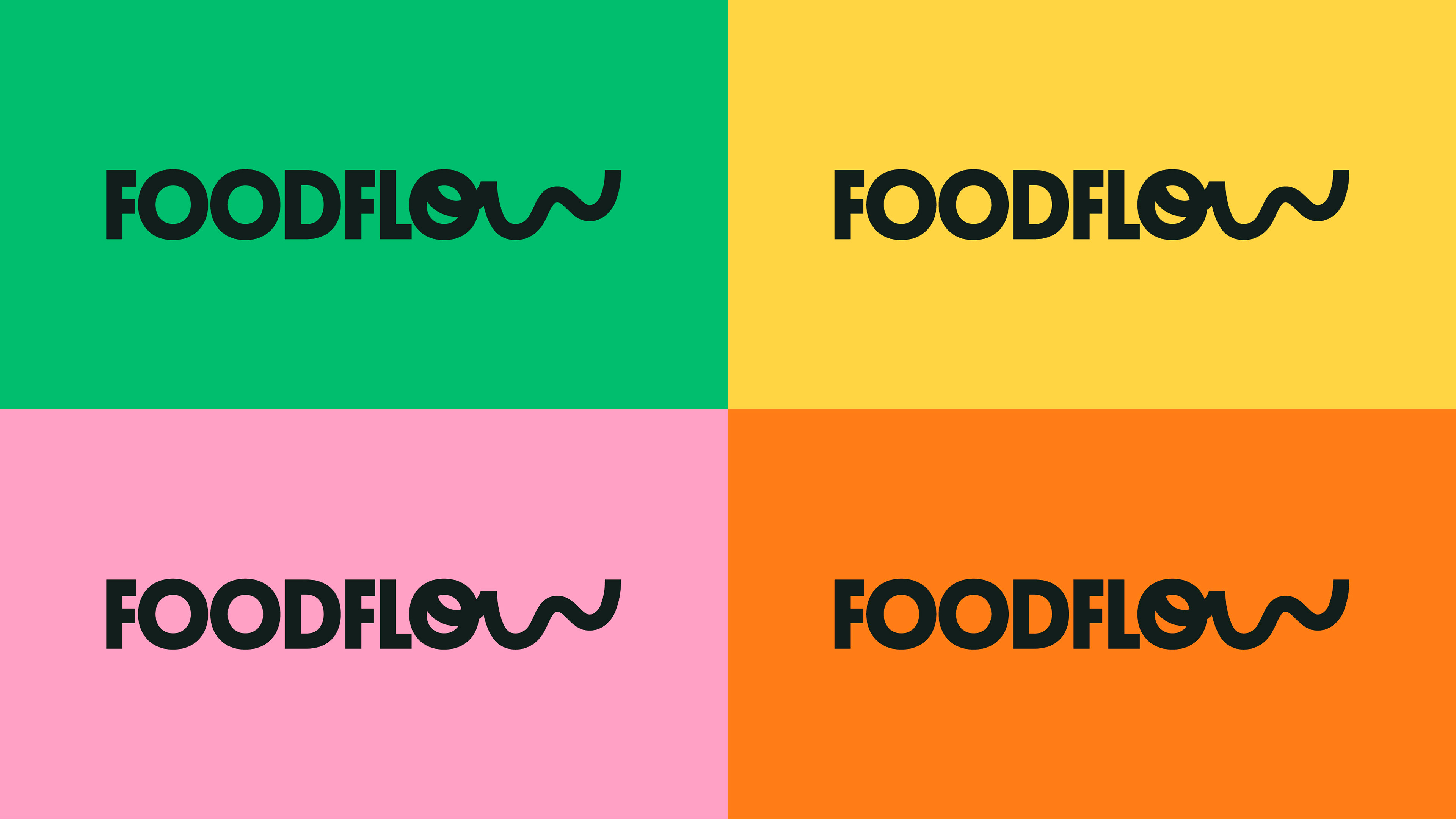

The identity avoids overused visual cues common in the category, helping Foodflow stand apart and appeal to a wider audience beyond traditional plant-based consumers.
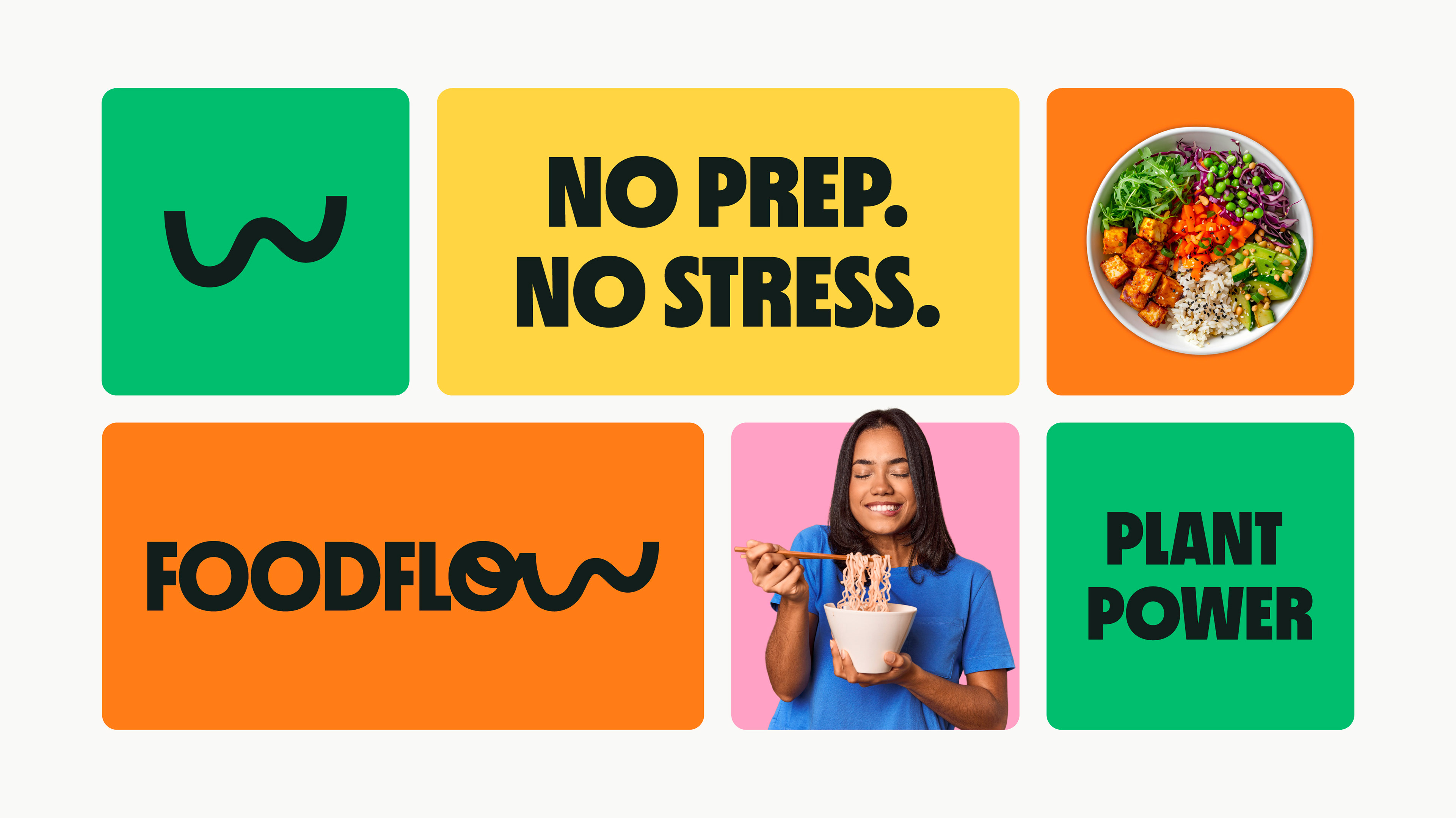
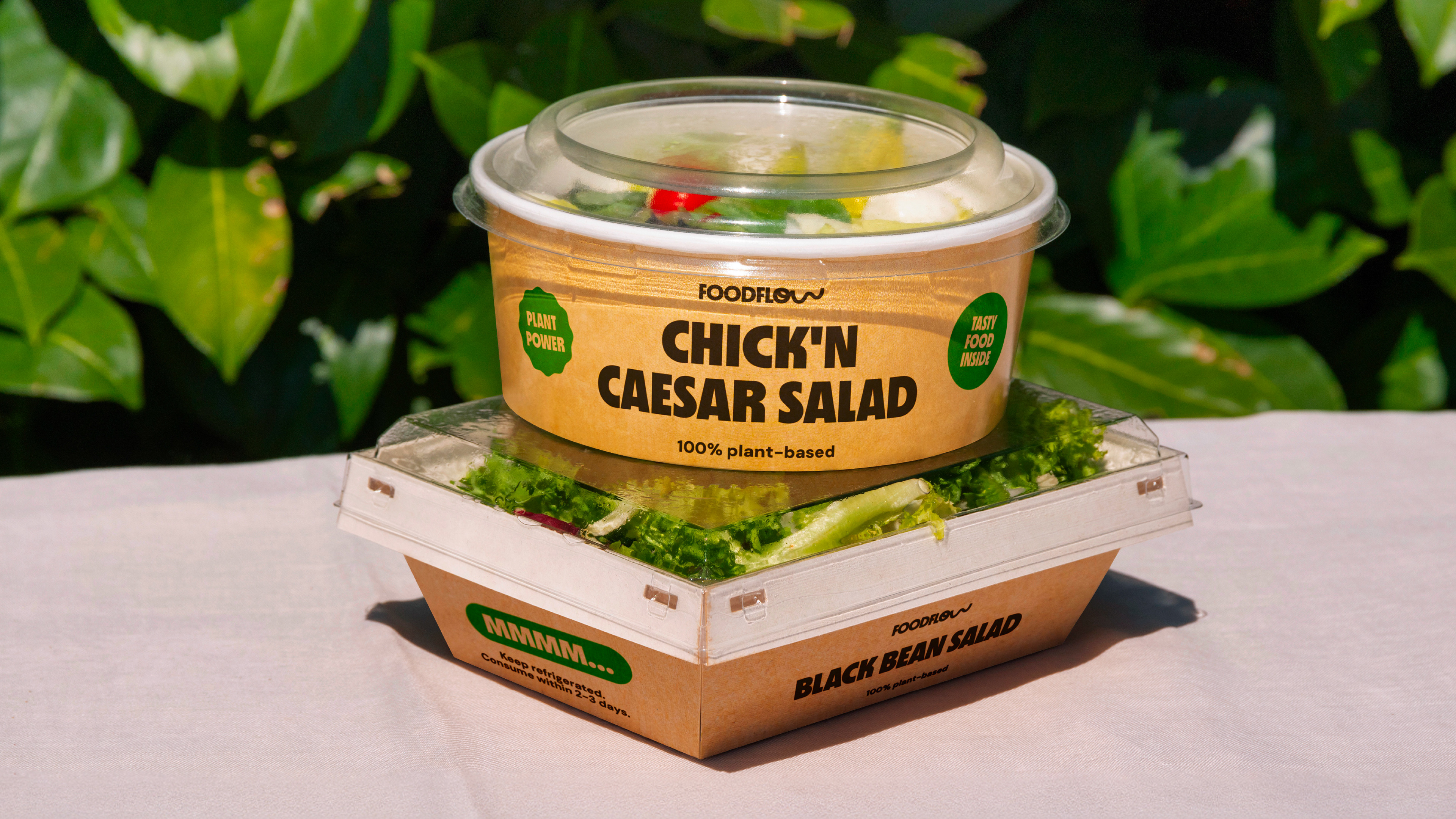
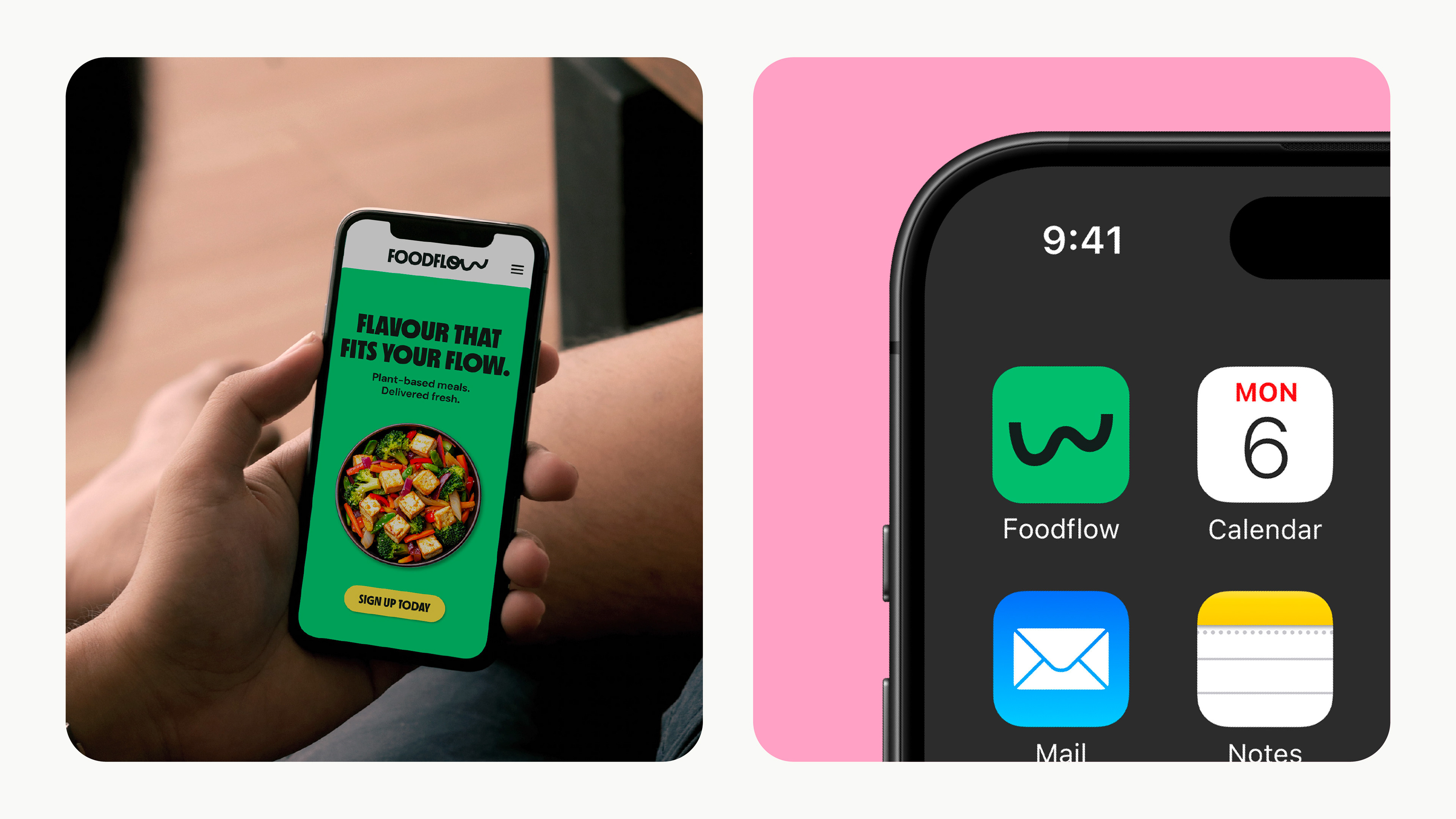
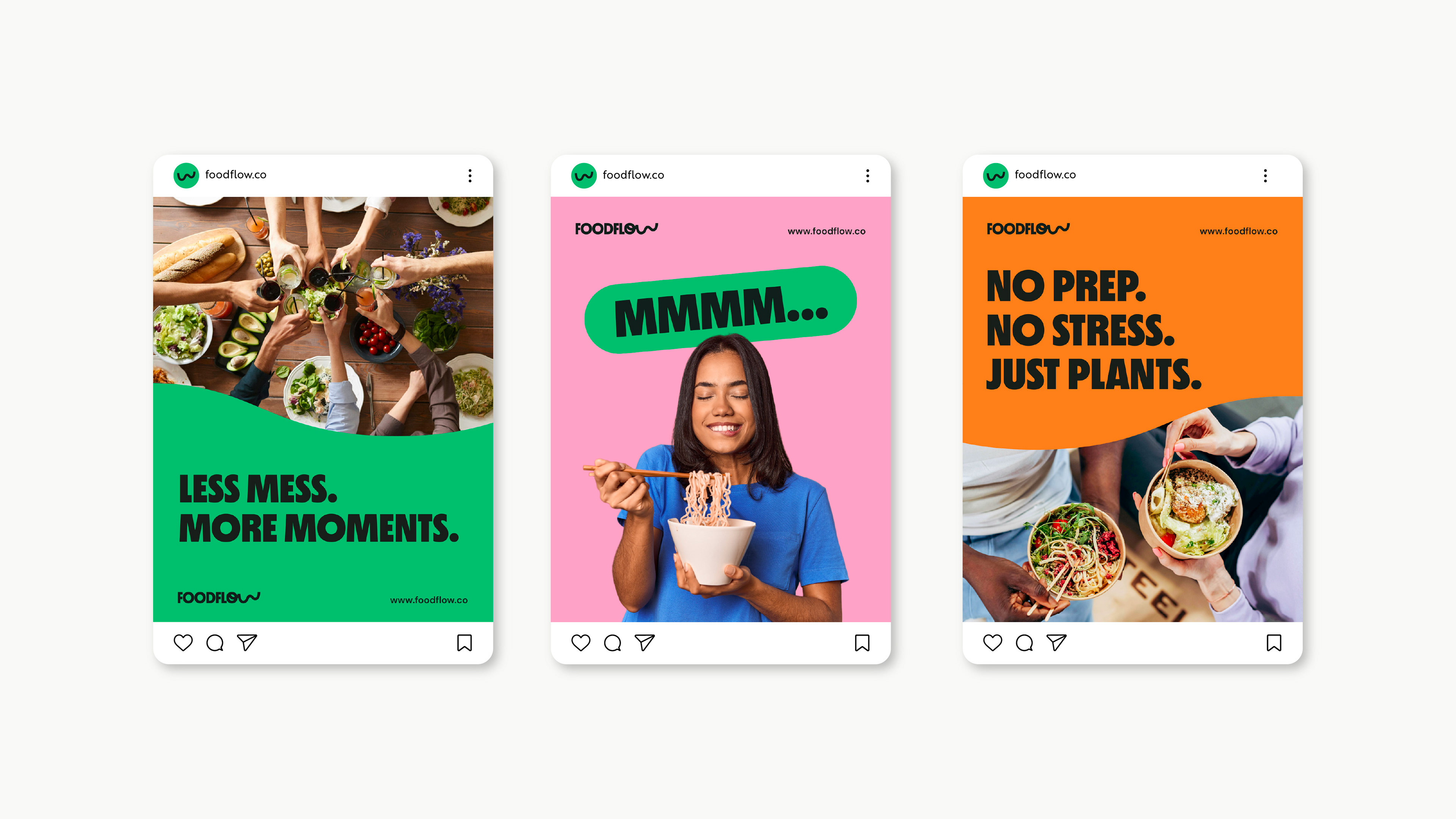
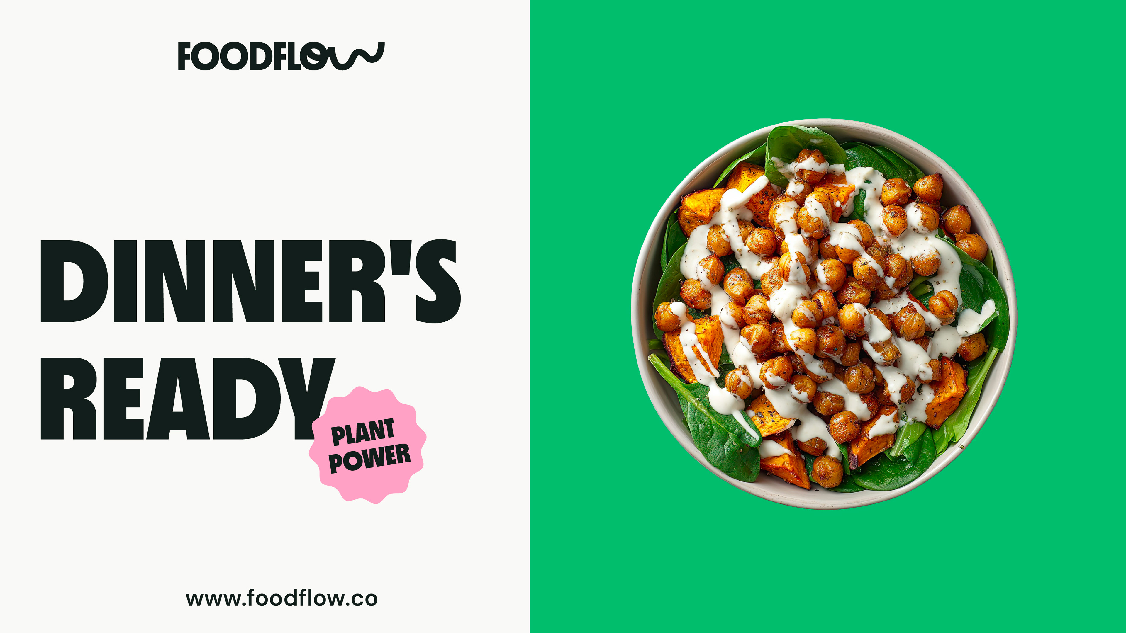
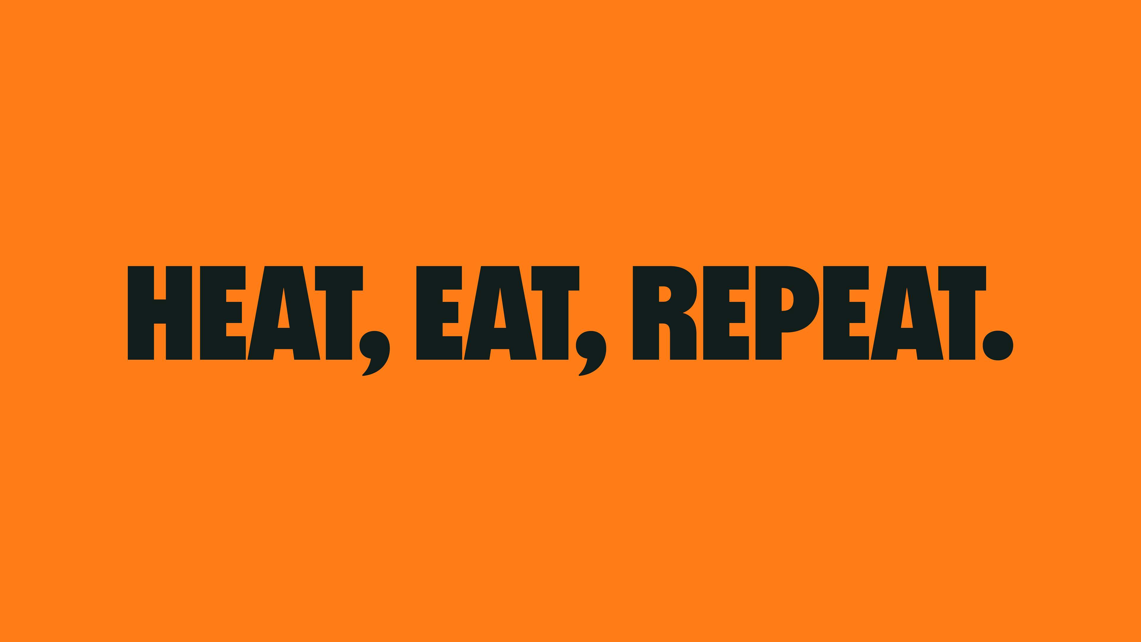
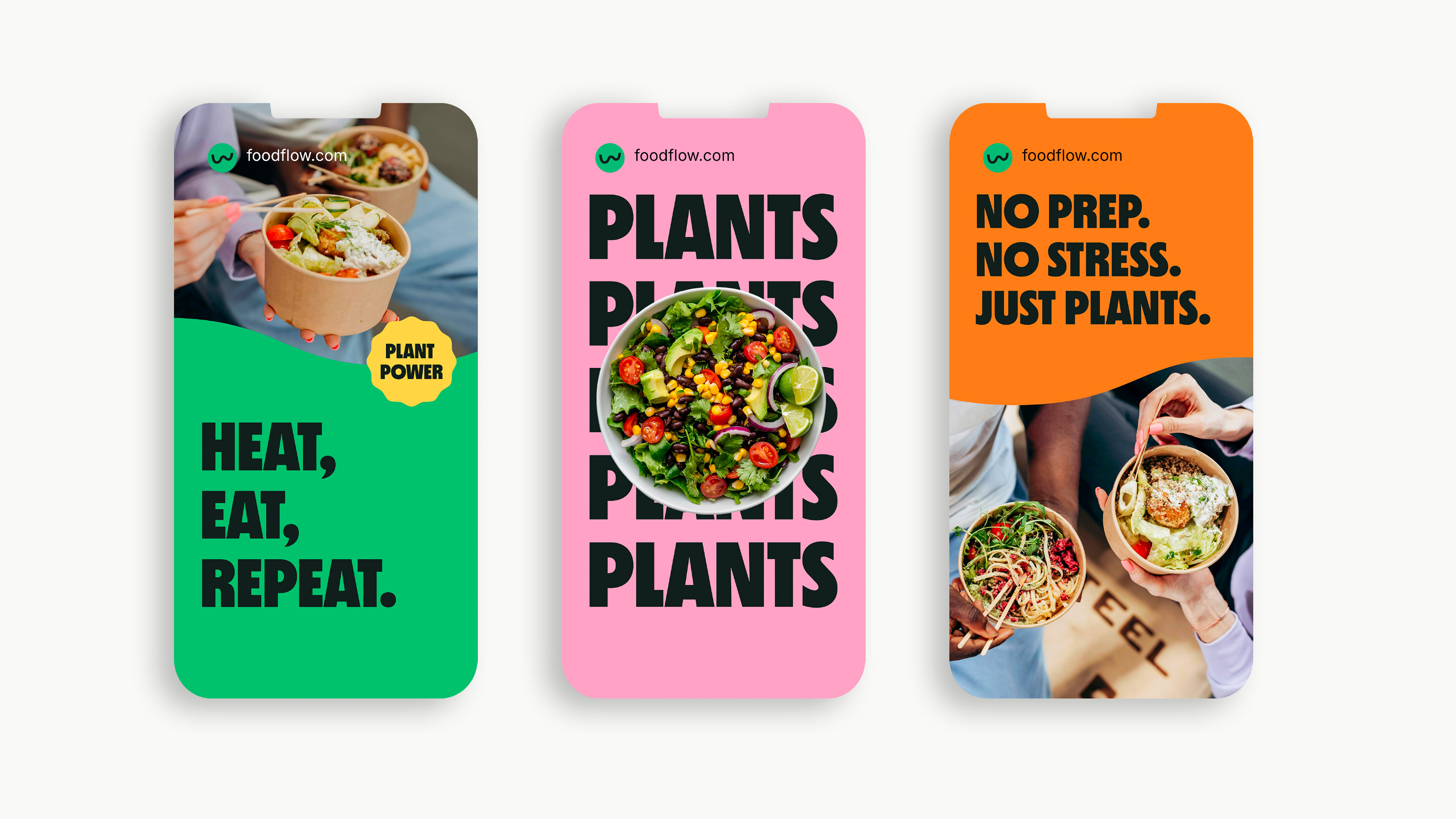
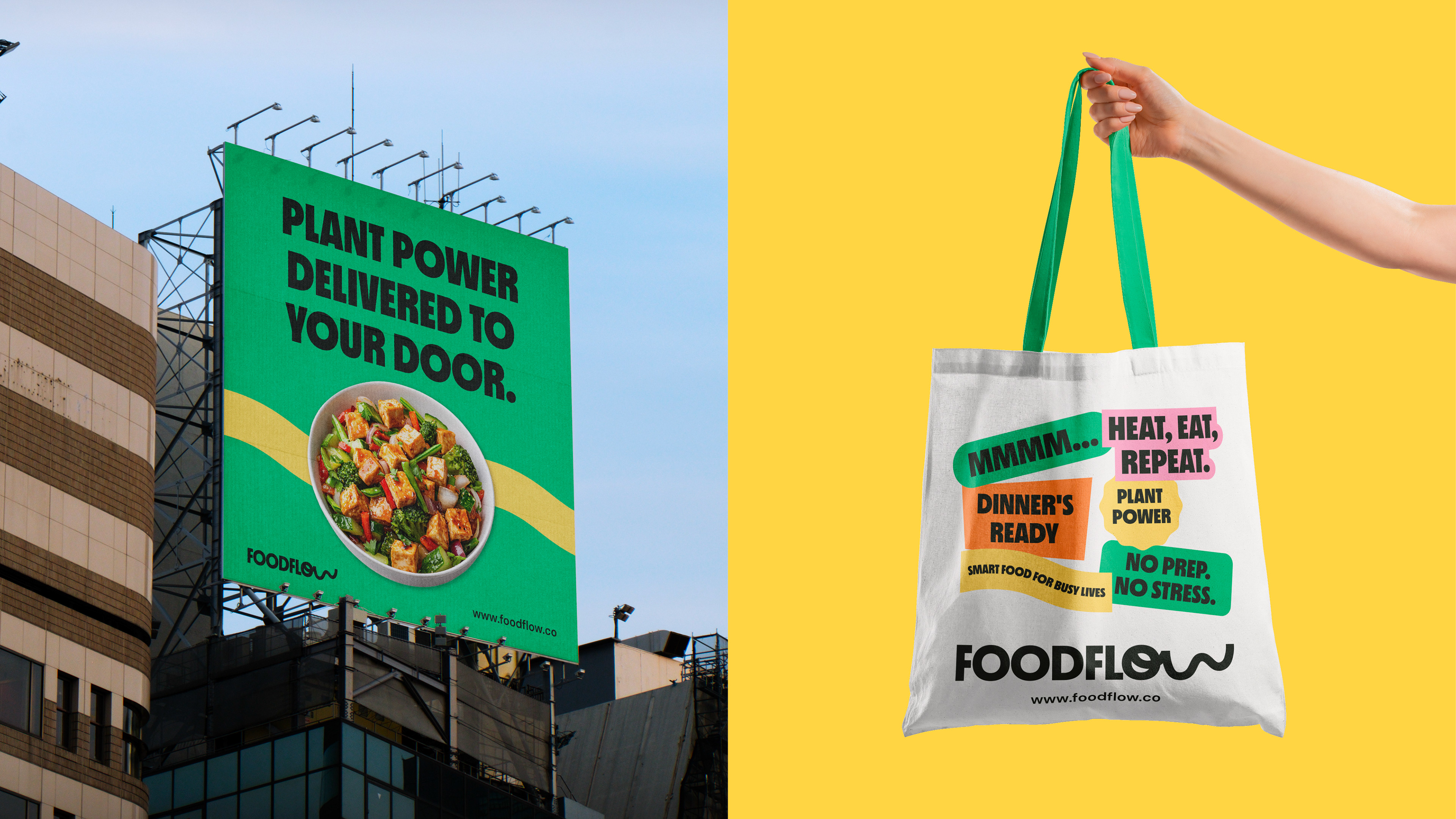
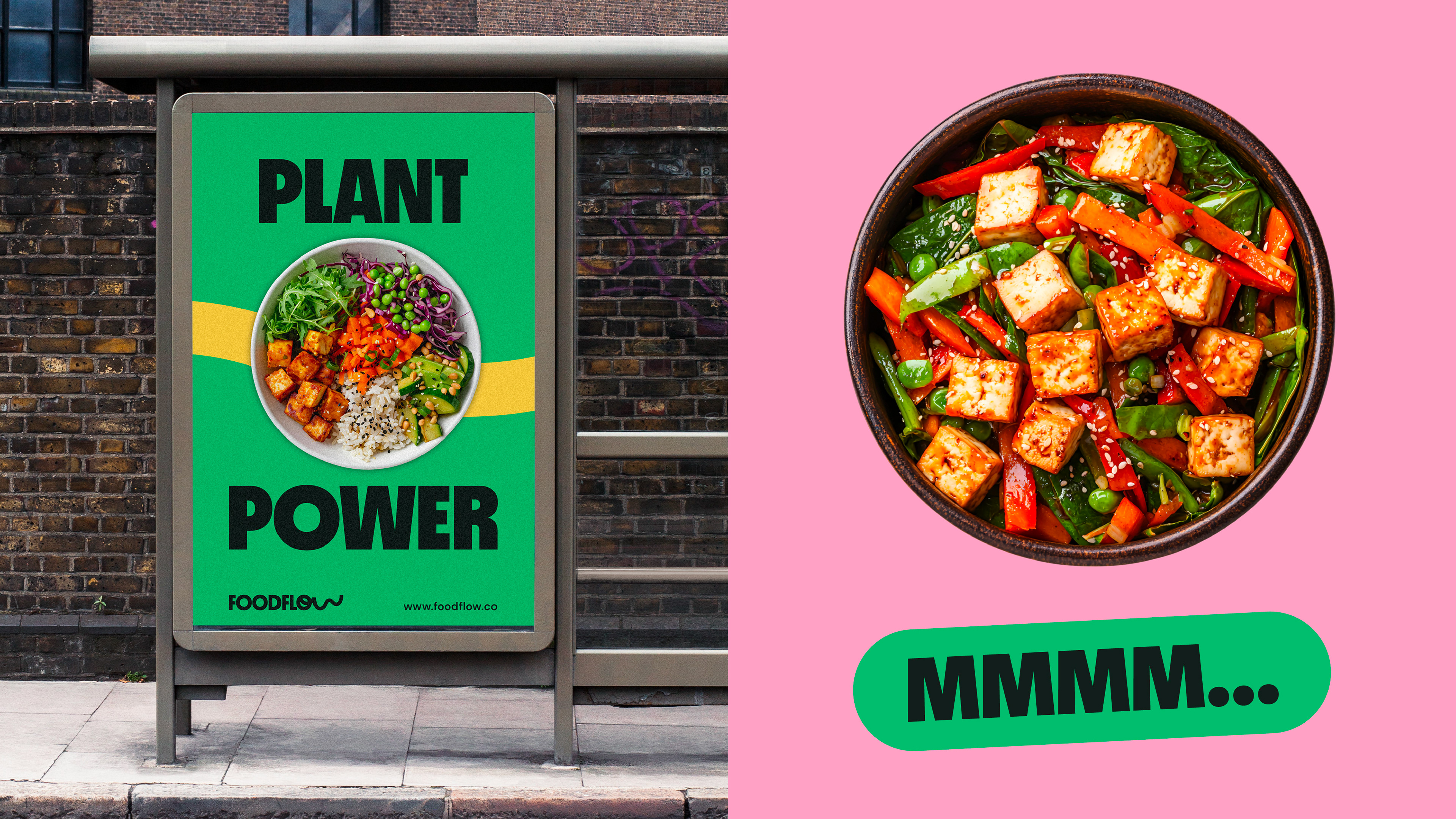
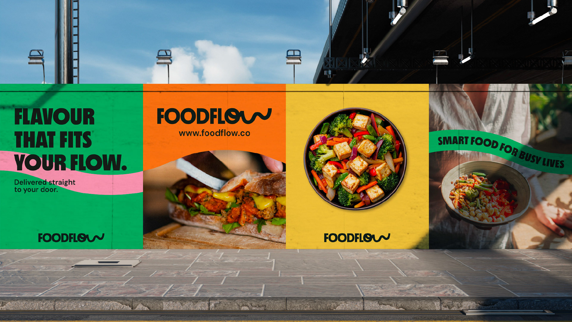
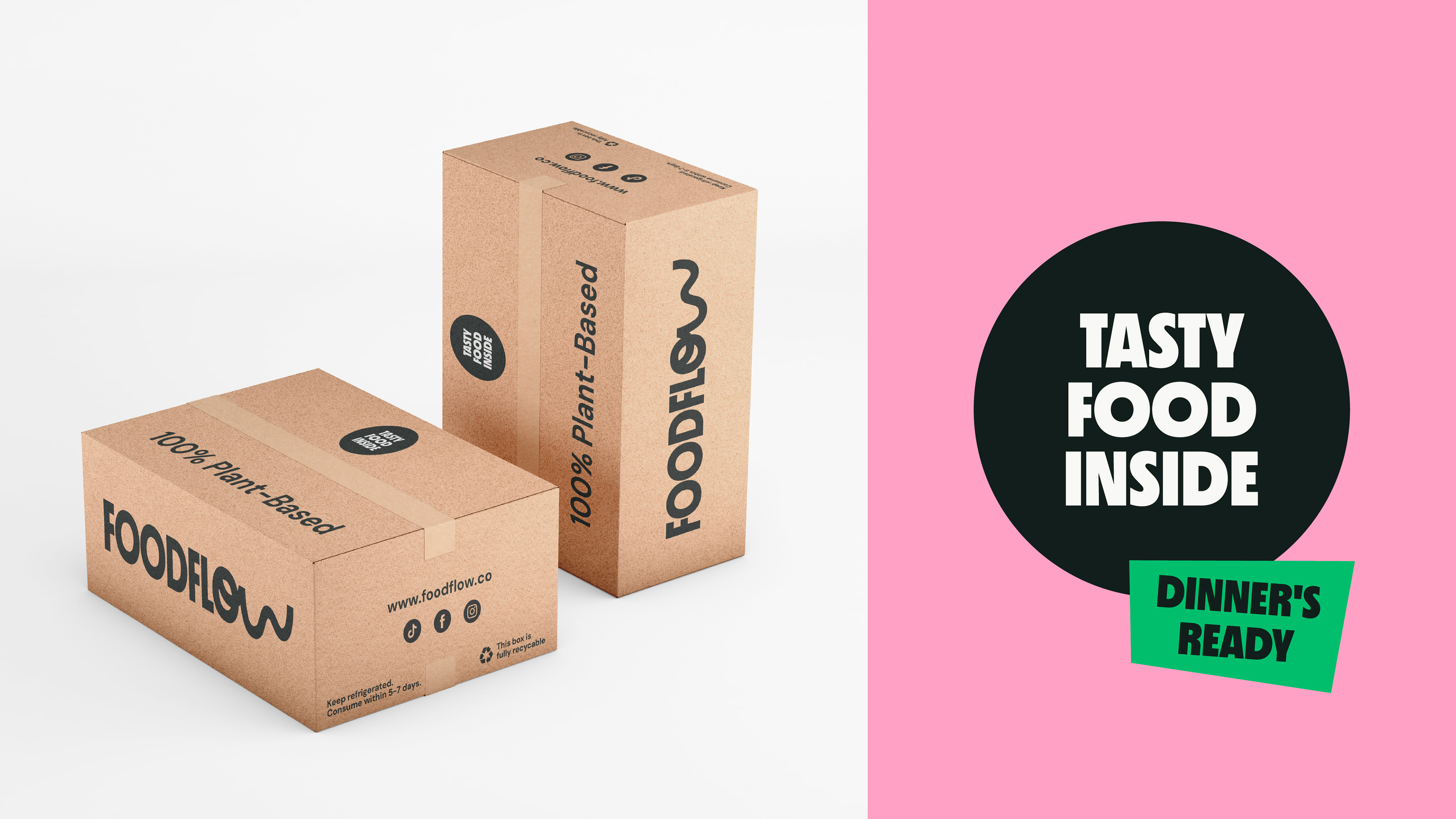
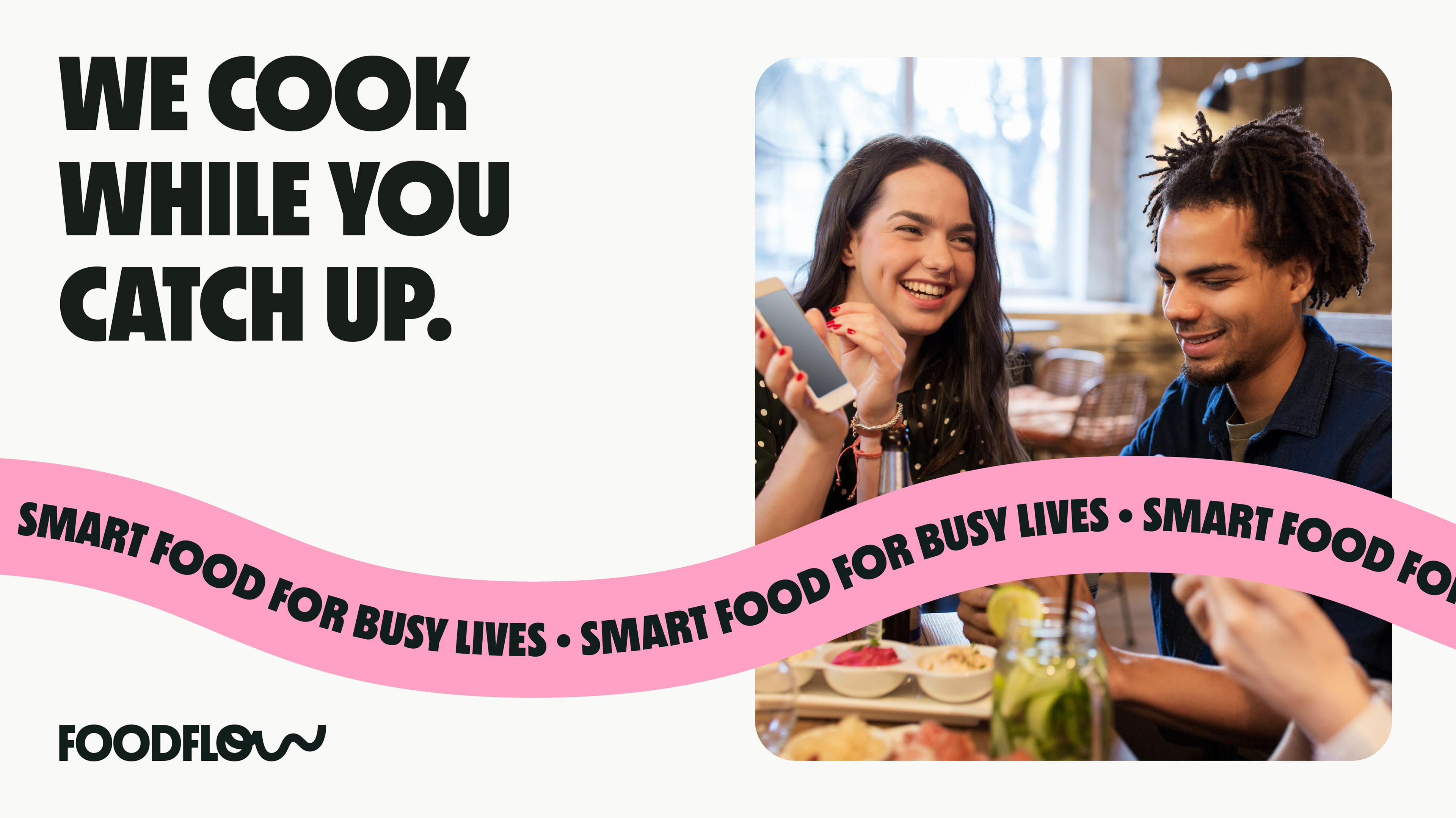
Clear messaging reinforces the convenience of the service, allowing potential customers to quickly understand its value. This ensures the brand communicates as effectively in marketing as it does visually.