
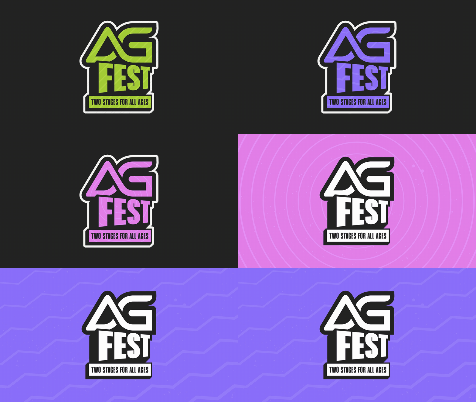
AG FEST | BRAND IDENTITY
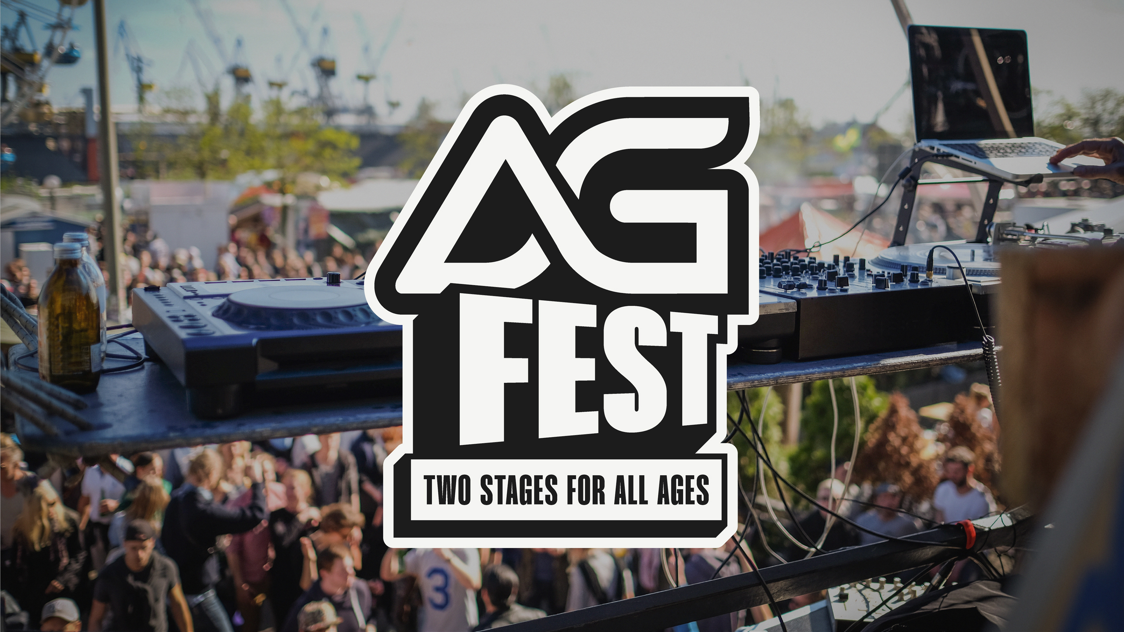
At the beginning of the year, DJ AG and his team reached out to us to create a brand identity for his first-ever music festival, AG FEST.
At the beginning of the year, DJ AG and his team reached out to us to create a brand identity for his first-ever music festival, AG FEST.
The goal was to create an inclusive, community-driven visual identity that would position AG FEST as a trusted, family-friendly annual festival, while building a recognisable brand that could grow with it for years to come.
The three key words the team wanted the identity to communicate were bold, welcoming and energetic. These became the foundation for the visual direction and helped us translate their vision for AG FEST into a distinctive and recognisable festival brand.

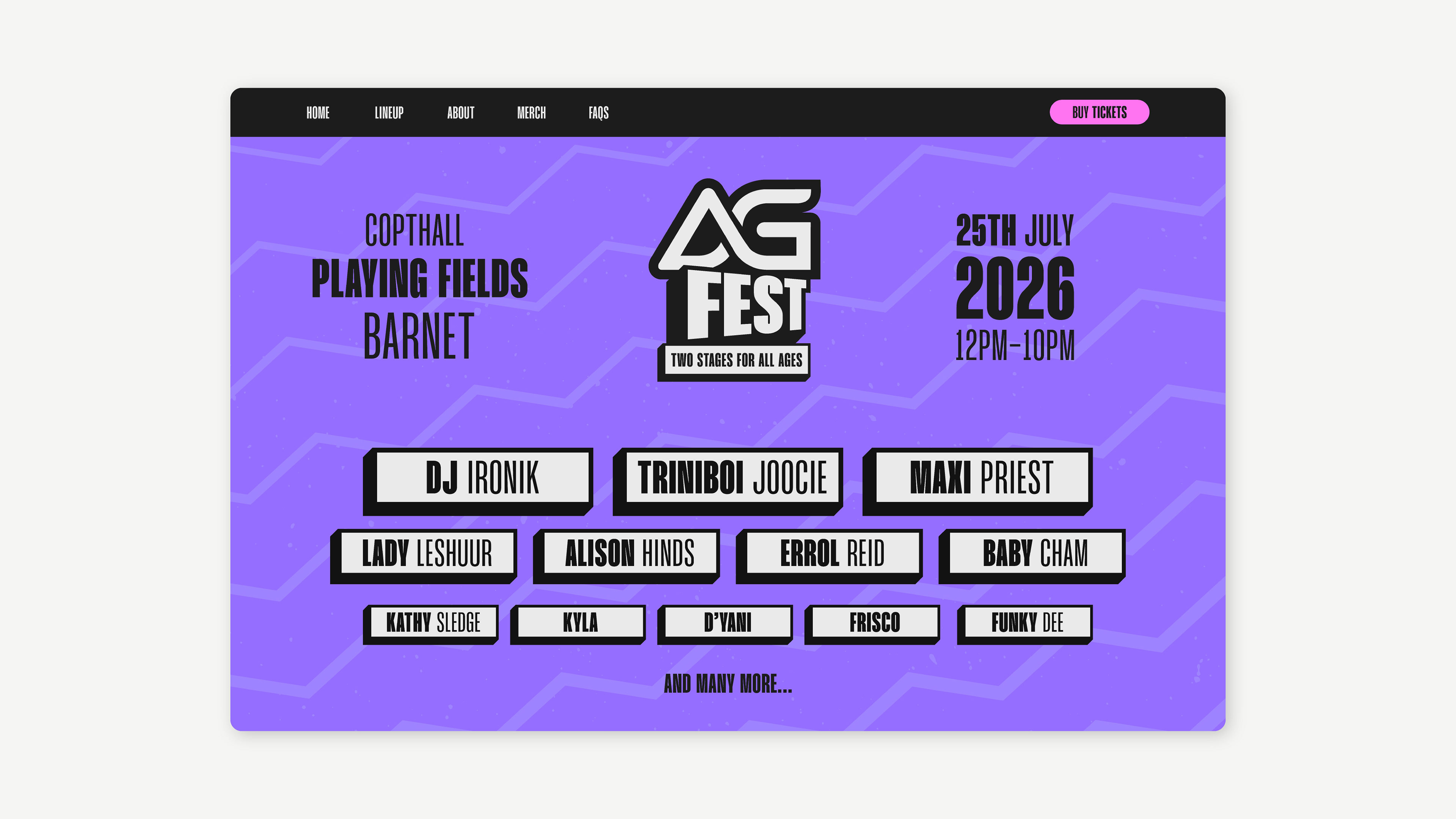
One of the biggest challenges was incorporating the existing AG logo, which was already well known within the community, into the new festival identity. Rather than changing something people already recognised, we kept the AG logo completely untouched and used it as the primary anchor of the new festival mark. This meant AG FEST could feel like something new while still benefiting from the recognition people already had with the AG brand.

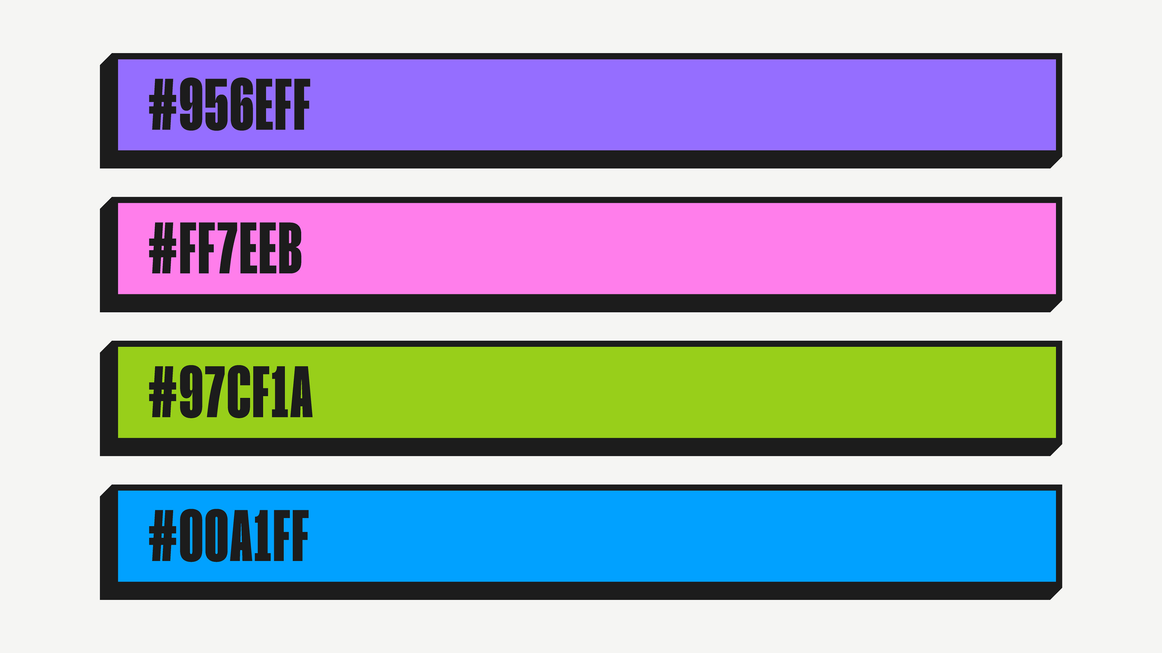
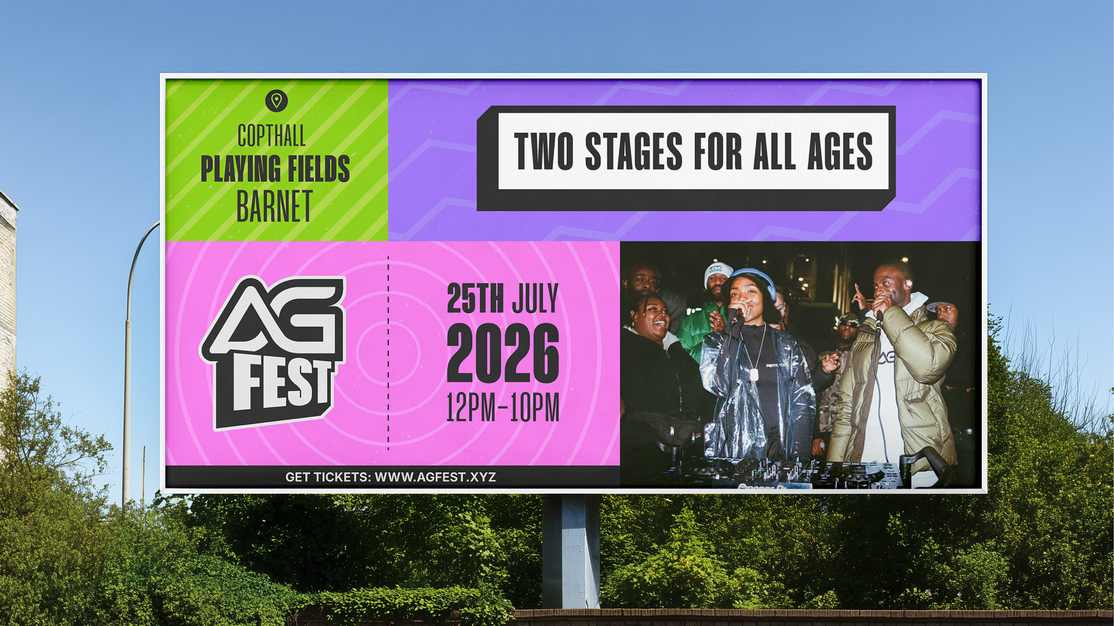
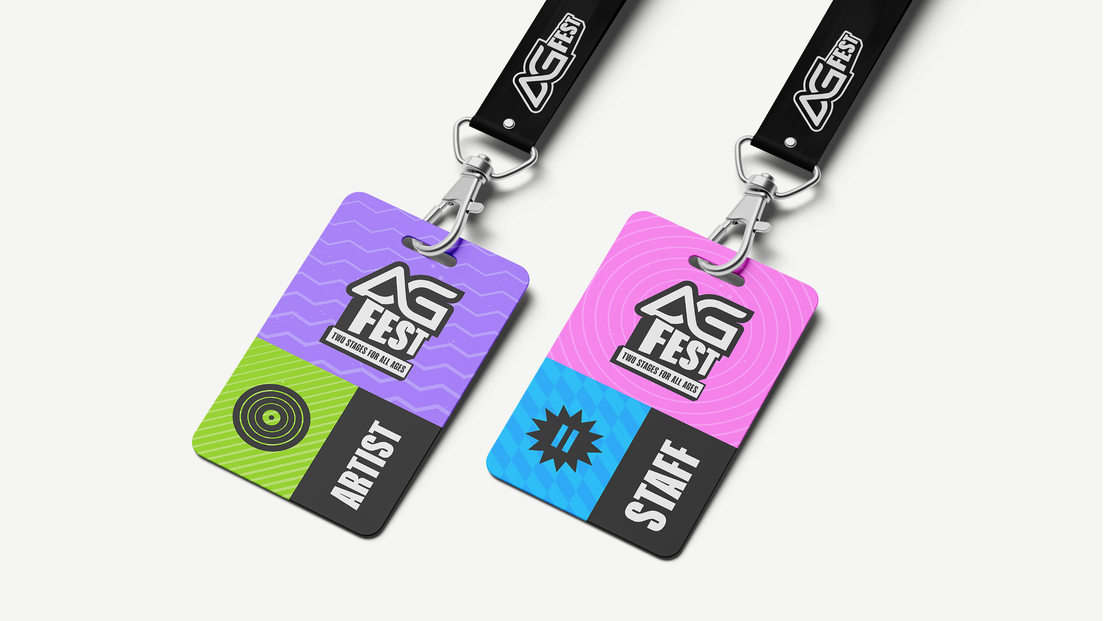
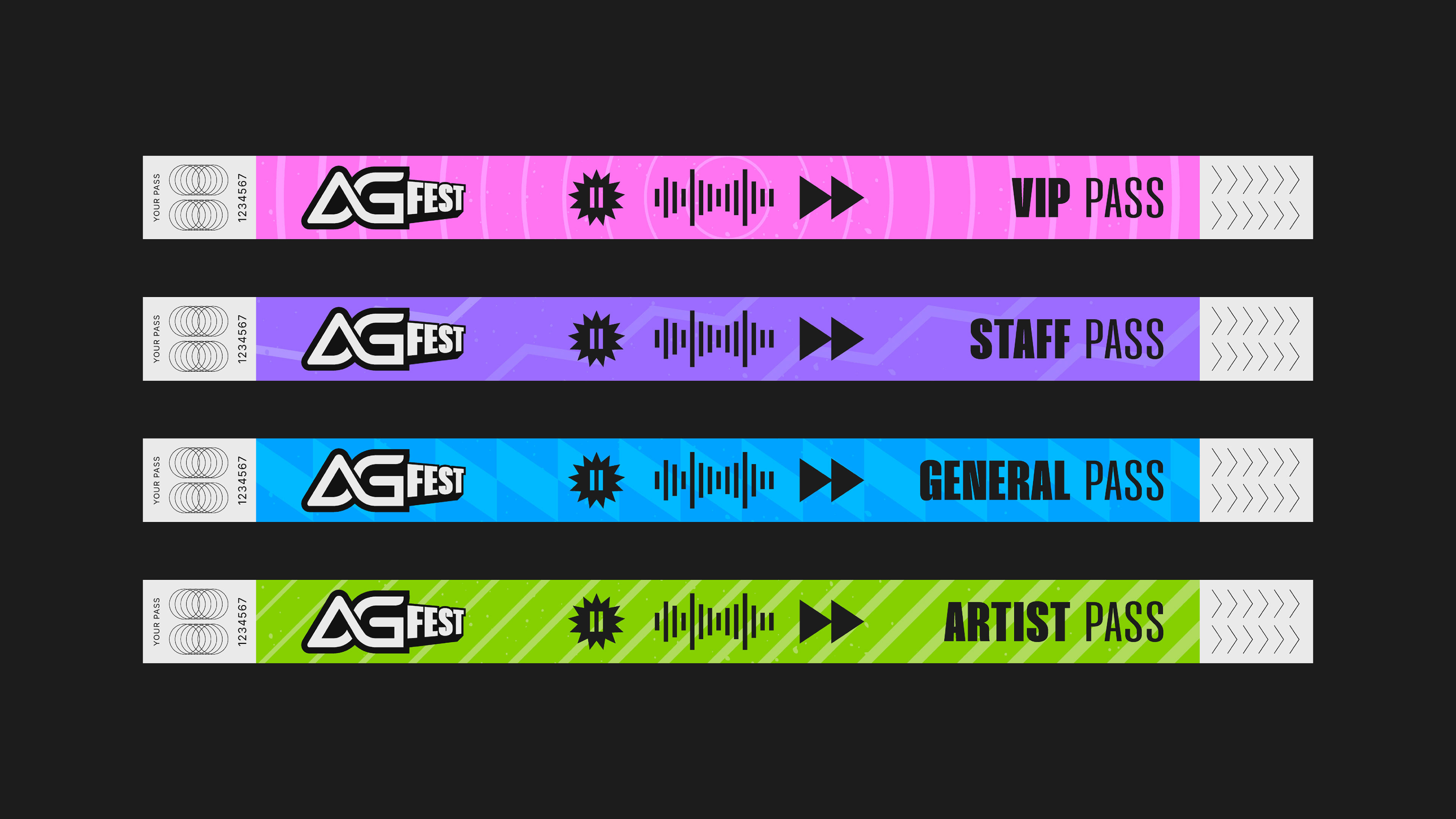
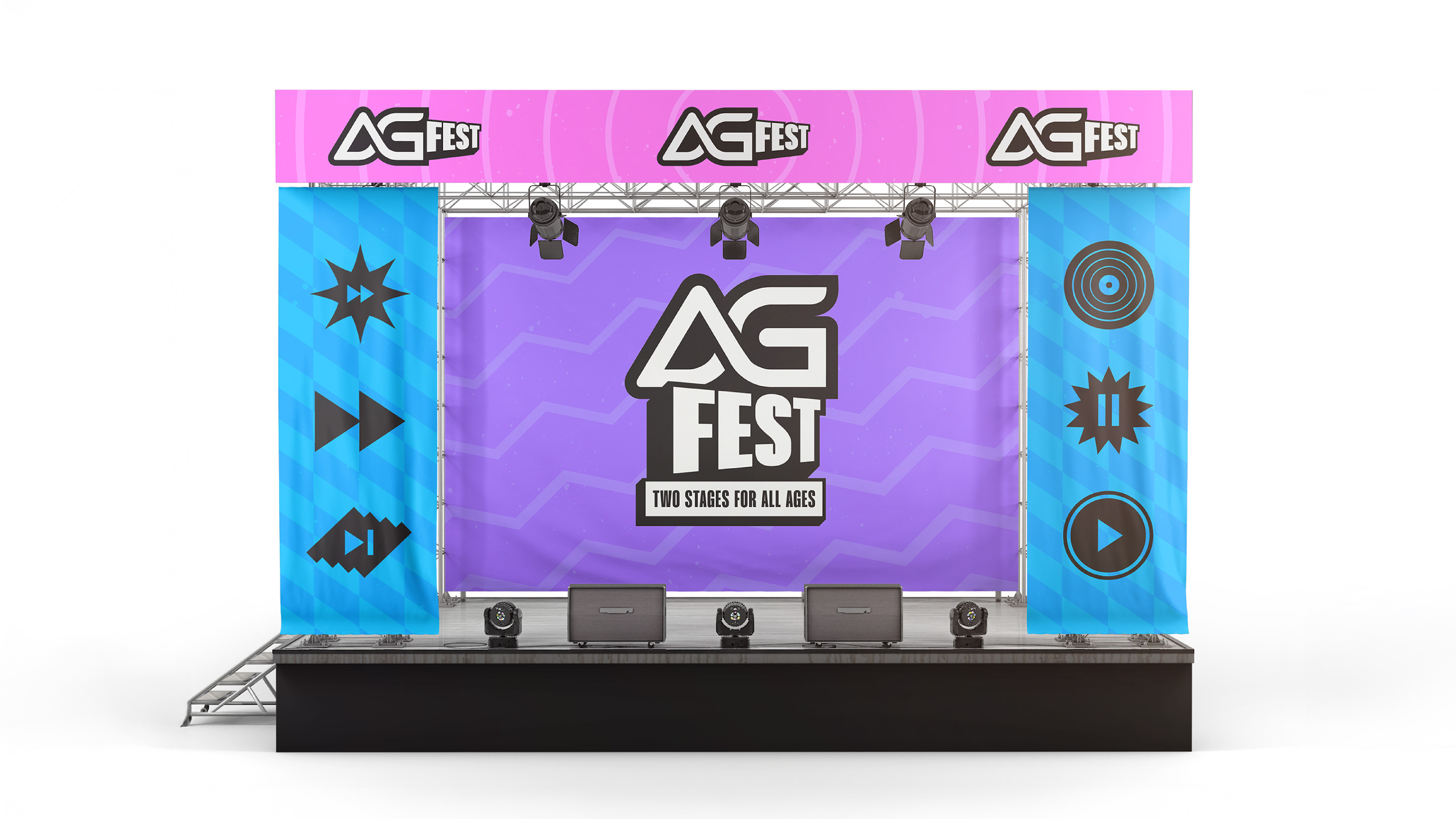
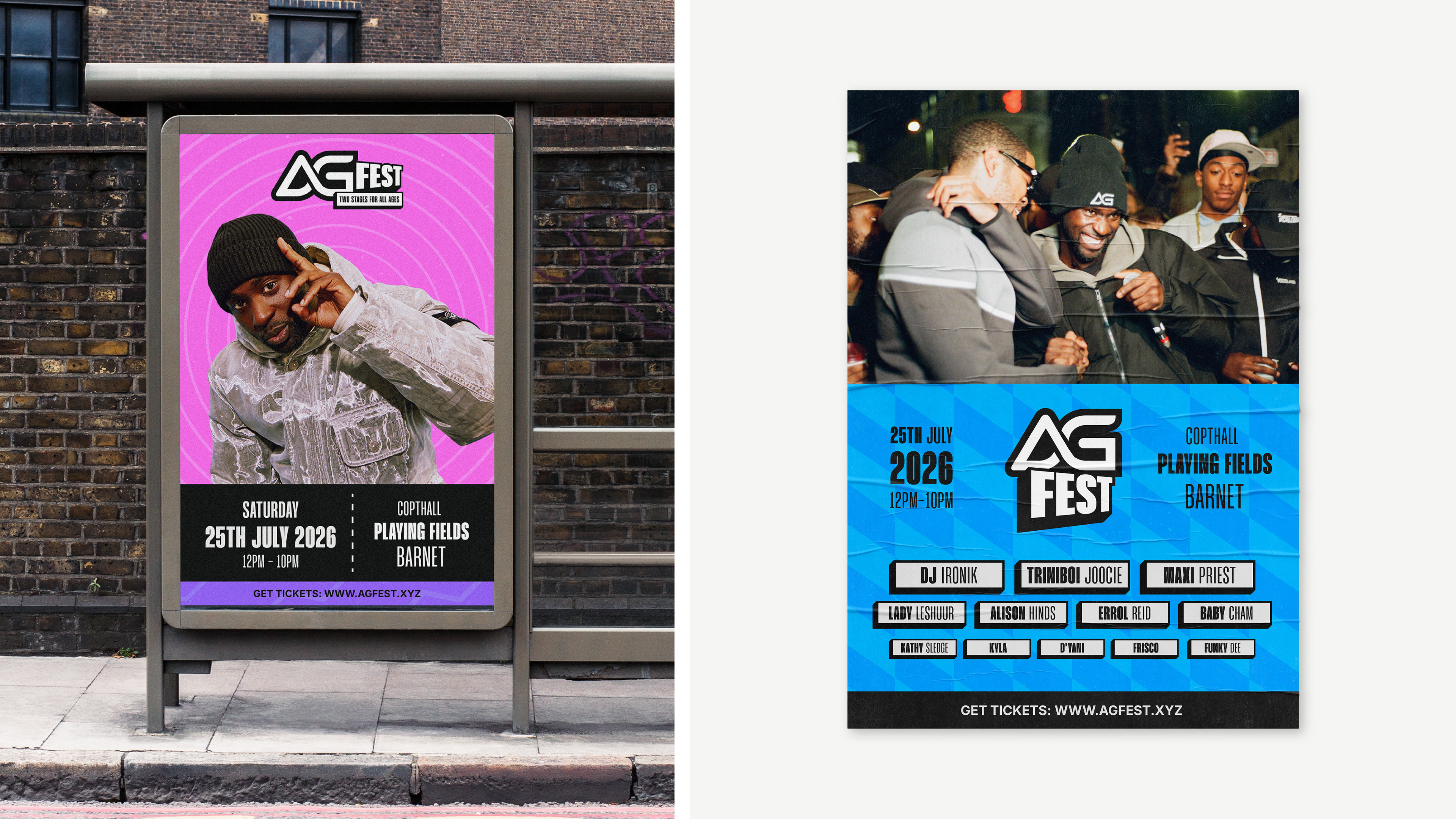
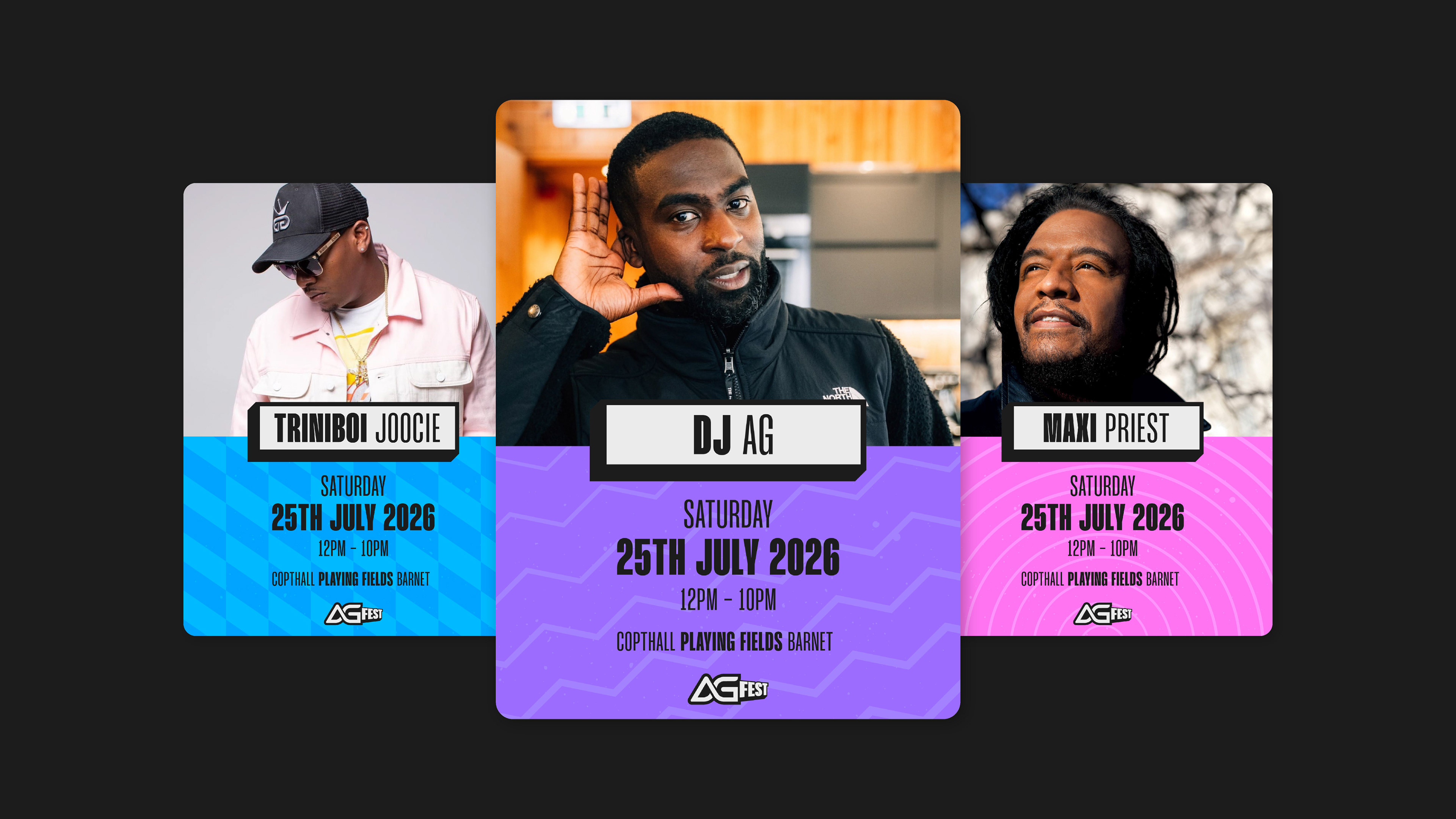
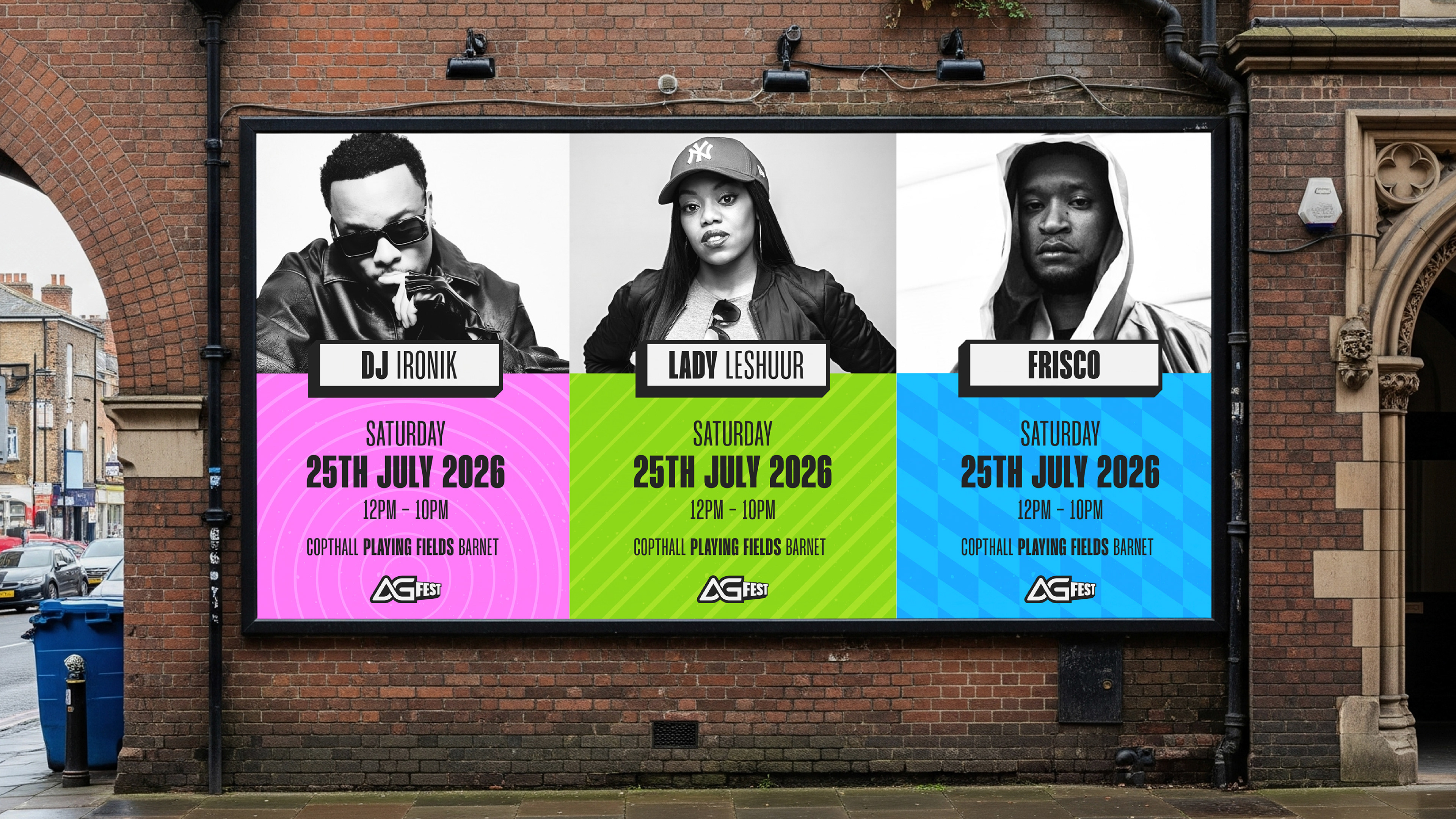
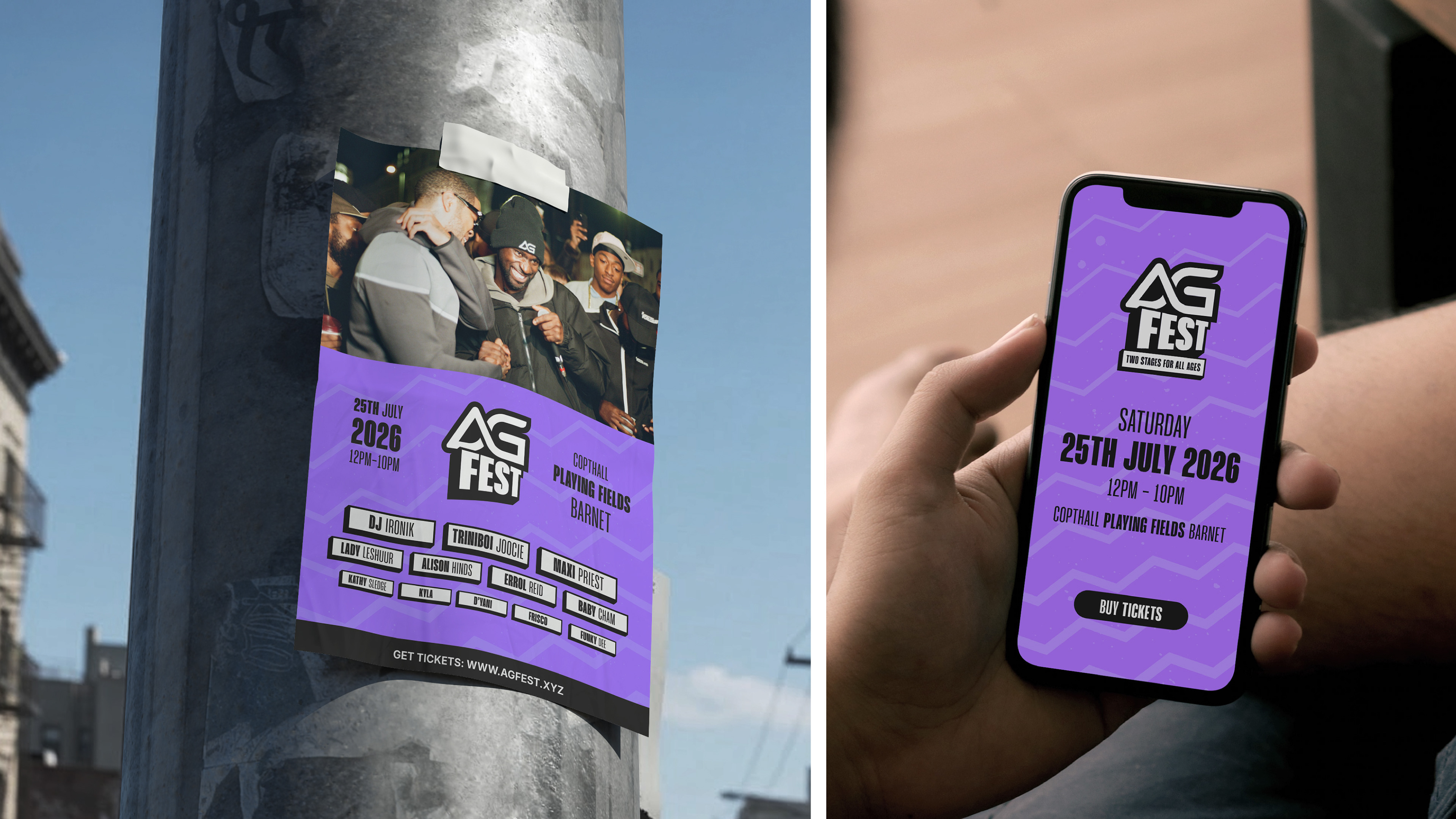
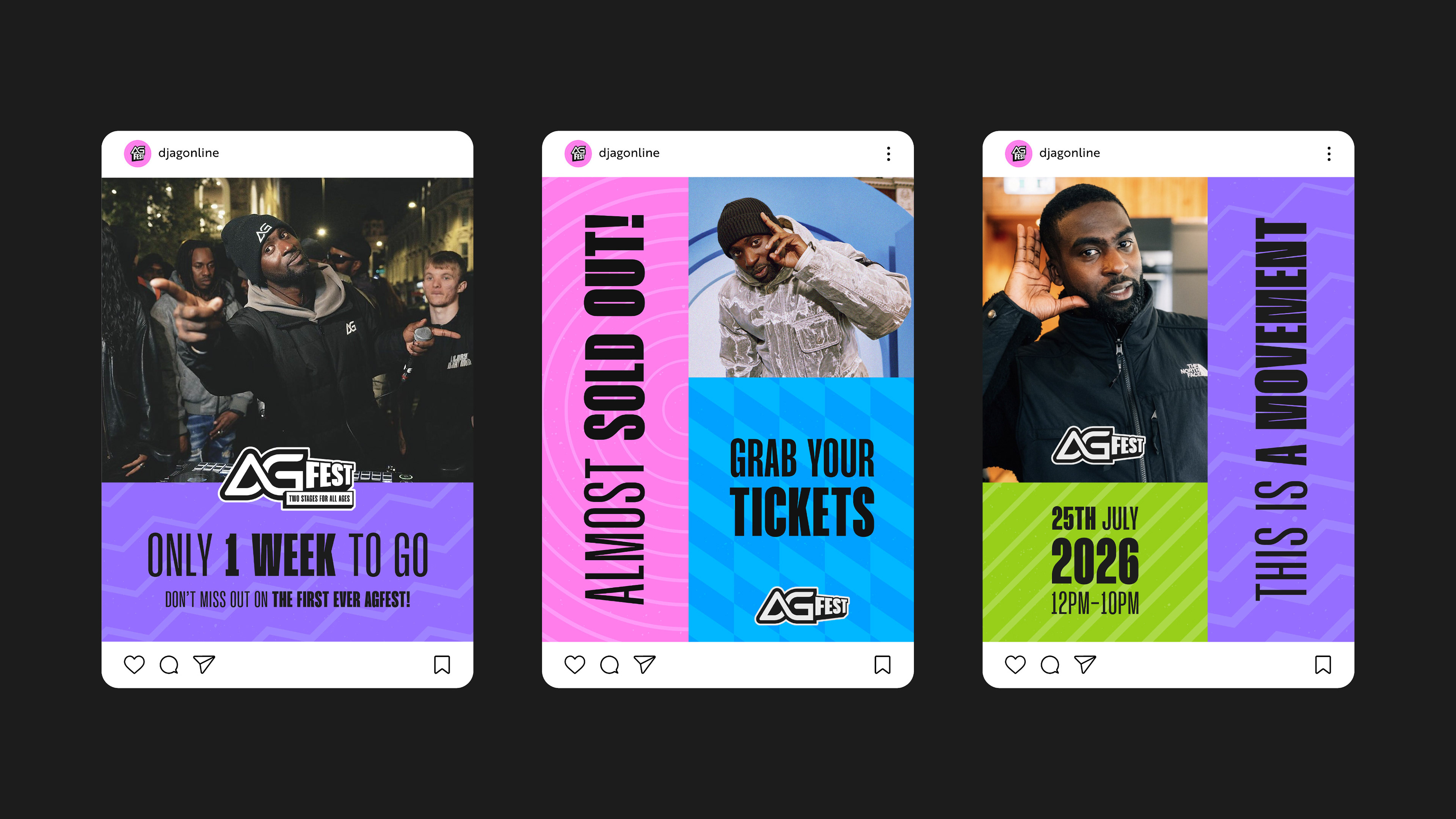
We then developed a vibrant colour palette and a series of patterns to give AG FEST a distinctive look that works consistently across its promotional materials. Bold typography in different weights adds even more energy and gives the identity flexibility across everything from social media and advertising to festival signage and printed materials.
The result is an energetic, attention-grabbing identity that feels welcoming and recognisable, giving AG and his team a strong visual foundation for their first festival and a brand that can grow with AG FEST year after year.
Got a project in mind? Let's talk!